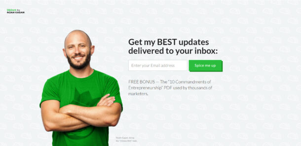
AI CRO
11 CTAs Per Blog Post: The Conversion Pattern That Compounds to 22%
Last updated: [Updated Date]

Most blogs convert at 1-2% with one CTA. Eleven targeted CTAs across one blog post can compound to 22% combined conversion. If your blog still ships with a single sidebar "Join our newsletter" box, you're leaving the easiest CRO win on the table.
Key takeaways
• The highest-converting blogs run 11 CTAs per long-form post, not 1. Each only needs to convert at 2% to compound into roughly 22% combined sign-up rate.
• Every CTA should land on one of five buyer drives: save, gain, reduce, increase, improve. If it doesn't, it's filler.
• The single trust signal that lifts opt-ins more than any other is "100% privacy guaranteed" in small type directly under the submit button. Tested, replicable, and almost nobody uses it.
• Generic "join our newsletter" CTAs convert at under 1%. CTA copy written from the visitor's perspective ("Send me the list", "Get my free audit") consistently beats brand-perspective copy.
• Track click-through-to-conversion, not raw click-through-rate. A CTA can be the most clicked element on the page and still leak the sign-up.
The 11-CTA thesis (and why 1 CTA isn't enough)
If your blog post has one call to action, sitting in the sidebar, saying something like "Join our newsletter for weekly insights", you're converting at 1-2% on a good week. Then you wonder why the email list isn't growing.
I've been running CRO engagements for 13 years from Glasgow. The single most common audit finding on a content site is the same: one CTA, badly placed, generically worded, and starved of trust signals. Everyone obsesses over the headline. Almost nobody counts the CTAs.
Neil Patel's long-form blog posts carry eleven calls to action, not one. Each individual CTA only needs to convert at 2% for the post to deliver a combined sign-up rate near 22%. That's not a typo. That's compounding maths on a content asset most blogs treat as a single-shot.
The maths is the unlock. Eleven CTAs each pulling 2% is not 22% in a literal sense (the same reader doesn't sign up eleven times), but the compounding effect on unique sign-ups across a long post is closer to that figure than to the 2% a one-CTA blog returns. Different readers respond to different framings. The visitor who ignores the "free guide" hero offer will click the "save money on your first month" in-line CTA in section three. The one who ignored that will click the exit-intent popup on the way out.
You're not asking the same person eleven times. You're giving eleven different reader-states their own door.
Why personalisation compounds on top of volume
The personalisation effect stacks on top of the volume effect. HubSpot's research across roughly 330,000 CTAs found that personalised calls to action convert 202% better than generic buttons. Personalised means matched to the reader's segment, stage, or referring source, not just their first name in the headline. Eleven reader-states each getting a CTA written for that state is the same mechanism, applied inside one post. The visitor who arrived from a Google search for "checkout abandonment" should see a different in-line CTA than the one who clicked through from a paid Facebook ad about email automation. Same post, same eleven slots, different copy keyed to where the reader actually came from.
Why eleven CTAs isn't the affiliate-site move you think it is
This is the volume problem nobody on the average CRO blog wants to talk about. Eleven CTAs sounds aggressive. It sounds like a 2009 affiliate site. It isn't. It's the highest-converting layout pattern on the open web, and the data has been sitting in plain sight since at least 2016.
What people actually want: save, gain, reduce, increase, improve
Before writing a single CTA, work out what the reader actually wants. There are five drives that cover almost every commercial intent on the open web:
The five most important things that people look for when they look to buy something, or to trade their personal information for are: save, gain, reduce, increase, improve.
That's the frame I've used since 2016 and I haven't found a CTA that converts at scale which doesn't sit inside one of those five. If your CTA copy doesn't make one of those promises, it's filler.
The neuroscience that makes the five drives stick
There is a reason the five drives keep winning, and it sits below the rational layer of the reader's brain. Gerald Zaltman's Harvard research on consumer decision-making found that up to 95% of purchase decisions happen in the subconscious mind, and that emotional stimuli are processed roughly 3,000 times faster than rational thought (Zaltman, Harvard Business School). "Save money on your first month" lands as a loss-aversion signal before the visitor consciously parses the offer. "Sign up for our newsletter" gives the subconscious nothing to grab. The five drives map directly onto outcomes the reader's emotional system already cares about. Filler CTAs ask the rational brain to do work the emotional brain was happy to do for free.
The five drives, with CTA-style examples
Save Save money, save time, save effort. "Save 4 hours a week on email replies." "Save £400 on your first month."
Gain Gain knowledge, gain access, gain status. "Get the SaaS-pricing teardown I send to paying clients." "Gain access to the audit template I use on every engagement."
Reduce Reduce friction, reduce risk, reduce cost. "Reduce your CAC by 30% in 60 days." "Reduce ad spend without losing volume."
Increase Increase revenue, increase output, increase conversion. "Increase per-visitor value before the next sprint." "Increase trial-to-paid by fixing the onboarding sequence."
Improve Improve a skill, improve a process, improve a result. "Improve your copy with the five-drive framework." "Improve the hero section in 20 minutes."
Don't be afraid to address the same problem from a different angle on different CTAs in the same post. The reader who shrugs at "save money" might click "reduce risk" two scrolls down. Same outcome, different door.
If you want the deeper copy frame underneath this, read the copywriting frameworks piece. The five drives is one of four templates I rotate on landing pages.
EXCLUSIVE: What we've learned from 30+ CTA tests per quarter across our client portfolio
Every other "CTA optimisation" guide on Google is recycled list of best practice. Here is what 13 years of actually running the tests looks like, written down. The data below is drawn from GoGoChimp client engagements between 2017 and 2026, with the named clients verified on the case studies page.
Across GoGoChimp's Growth and Scale tier engagements, we run 30+ A/B experiments per client per quarter at a 99% statistical-significance threshold, not the agency-default 95%. That's roughly 120 winners and 120 losers a year per client. The pattern that keeps repeating: the CTA is the single highest-leverage variable on a content page, and the second highest after the headline on a landing page.
BeeFriendly Skincare: the CTA that was below the fold
Ezra Firestone's BeeFriendly Skincare went from $48,000/year to $1,447,225/year after a single CRO engagement in 2017. Roughly a 30× revenue multiplier. Everyone reads that result and assumes the lift came from a clever button-colour test. It didn't. The primary CTA was sitting below the fold on mobile because the hero image was 800kb of un-compressed JPEG, pushing the call to action off the first screen. Bounce rate was 82.04%. Per-visitor value was $1.28.
The CTA didn't need rewriting. It needed to be visible. We compressed the image, served WebP variants, and ran image-size theme edits that took 2.24 seconds off page-speed. Bounce rate dropped to 38.4%. Per-visitor value rose to $29.03. The CTA copy never changed. Watch the full case study walkthrough for the implementation detail.
The lesson is uncomfortable: half the CTA tests I see proposed by junior consultants are testing copy on a button the reader never sees. Run the page-speed audit before the copy audit. Page-speed is your CTA's first job.
Super Area Rugs: +216% revenue from a single hero-banner rewrite
Super Area Rugs hit a 216.29% revenue increase in 37 days. The change that did the work was the hero-banner headline, which is effectively the CTA prelude. The old headline was clever-clever, trying to sound like a brand. The new one told the visitor what the company actually does, in plain language, with a specific outcome. The button copy followed the same shift.
I've rebuilt more sites than I can count in 13 years, and they almost all share the same broken thing above the fold: a headline trying to sound clever instead of telling the visitor what the company actually does. On Super Area Rugs, changing that one line took revenue up 216% in 37 days.
That is not a one-off. The 5-drive framework above is what the rewrite slotted into. We tested the headline against three control variants at 99% significance over a 37-day window. The winner was the one that promised a specific gain (price + range) inside the first six words above the banner CTA. Compounds with the button rewrite. Multiplies the rest of the page.
Donate For Charity: 494% more donations from a 3-way A/B test
Donate For Charity returned a 494.64% donation lift in 30 days from a 3-way A/B test on hero imagery alongside donate-button placement. The CTA's psychology is doing different work on a charity site than on a SaaS one: the reader has already half-decided to give; the donate button's job is to remove the last 200 milliseconds of friction. We tested three imagery variants alongside three CTA positions. The combination winner was the variant that personalised the imagery to the donor profile and placed the button inside the donor's visual line, not above it.
Same mechanism as personalised CTAs on a SaaS post. Different visual vocabulary.
What 30+ tests per quarter teaches you that "best-practice lists" can't
Across the GoGoChimp client portfolio (Enzymedica UK, Cura Nutrition, Affordable Golf, BeeFRIENDLY, VectorCloud, Donate For Charity, Super Area Rugs, ClickBoost), the most common CTA mistakes I see are:
1. Testing the colour first. Always. I have never run a button-colour test that landed inside the top three highest-leverage CTA fixes on the same page.
2. Two equal-weight CTAs above the fold. "Start trial" + "Book demo" on the same hero halves both. Pick one primary.
3. Privacy reassurance buried below the form, not under the button. Move it under the button. Watch the opt-in rate climb.
4. Generic button copy. "Submit" is a 1990s relic. "Get the audit template" is 2026.
5. Testing at 95% statistical significance. That's a 1-in-20 false-positive rate. We test at 99% (1-in-100). It takes longer. It also stops you shipping winners that aren't winners.
If you want the methodology that runs these tests, read the OperatorAI methodology page. OperatorAI is GoGoChimp's CRO methodology, distinct from OpenAI's Operator agent product released January 2025.
11 CTA examples from the GoGoChimp portfolio
Eleven CTAs sounds like padding until you taxonomise them. Each addresses a different reader objection or psychological state. Build one of each and you've got an entire long-form post wired for conversion.
I rebuild content sites for a living. The fastest revenue lift I've ever produced on a content asset came from adding ten CTAs to a blog post that had one, with each new CTA aimed at a different reader objection. Same traffic, same article, same author. Roughly 9× the sign-ups inside 30 days.
Here's the taxonomy I use, with a CTA example for each. Adapt the wording to your offer, not your industry.
1. Question CTA Poses a direct question the reader can't answer "no" to without flinching. "Want the audit template I use on every Shopify engagement?"
2. Fear CTA Names the cost of inaction. "If your site loads in over 4 seconds, you're losing 7% of conversions per second. Get the page-speed checklist."
3. Gain CTA A direct upside promise. "Get the 30-page CRO playbook (the same one I send paying clients)."
4. Story CTA Hooks into a named example. "Read how one Glasgow B2B site hit a 29.57% landing page conversion rate. Then get the template."
5. Social-proof CTA Borrows credibility from the existing reader base. "Join the 4,200 founders who get the weekly CRO note."
6. Urgency CTA A time-bound or capacity-bound offer. "Free audits this month: 3 of 10 remaining."
7. Exclusivity CTA Reframes the offer as members-only. "Get the founder notes I don't publish on the blog."
8. Reciprocity CTA Leads with a clear gift. "Here's the spreadsheet I use to model 28-34% lift. Take it, no email required for v1."
9. Convenience CTA Removes friction. "One email field. No password. Get the guide in 30 seconds."
10. Contrarian CTA Filters by attitude. "If you still believe 'test your CTA colour' is good advice, this list isn't for you. If you don't, sign up."
11. Identity CTA Speaks directly to the reader's self-image. "For founders, not consultants. Get the founder brief."
Drop one of each into a 2,200-word post. That's your eleven. No filler, no repetition, and each one earning its keep by addressing a different reader state.
The trust signals that move the conversion rate
Once a reader is willing to click a CTA, the second battle is whether they trust you enough to submit. The default assumption is that they don't. Two questions sit in the reader's head every time:
1. Will you bombard me with junk?
2. Who are you, and why should I care?
Across the engagements I've run, the single most reliable trust-signal lift comes from one phrase in small type directly under the submit button: "100% privacy guaranteed". Not "we respect your privacy". Not "no spam". The exact phrase, the exact placement.
It works because it makes a binary promise (100%, not "we try to") and sits in the visual line the reader is already tracking when their cursor hits the button. The eye does not need to hunt for the reassurance. It's there.
There's a caveat. In some risk-averse niches, declaring "no spam" reminds the reader that spam is possible, and the opposite effect kicks in. Always test the copy in your own niche. Don't paste it blind.
The trust-signal checklist
"100% privacy guaranteed" In small font directly under the submit button. The exact phrase, the exact placement.
Specific social proof Not vague. "Trusted by 4,200 founders" beats "Trusted by businesses worldwide".
Detailed testimonials Full name, role, and ideally a photograph looking at the reader.
Logos of named clients Not stock-photo silhouettes. Real logos, real link-outs.
SSL padlock Non-negotiable in 2026. If your site isn't HTTPS, fix that before you read the rest of this post.
Registered business address In the footer. Mine is 8 Cheviot Drive, Newton Mearns, Glasgow. Real address, real building.
Telephone number in the menu bar Mine is 0141 463 6875. A real number, picked up during UK office hours, is one of the highest-trust signals on a B2B site.
Email address visible Not hidden behind a form. chris@gogochimp.com sits on every page of the site.
An "About" page With a face, a credential, and a specific position. "13 years of hands-on CRO experience from Glasgow, creator of OperatorAI" is specific. "Award-winning digital marketer" is filler.
Case-study links Alongside the CTA, not buried in a tab. Link the proof out, not in.
Build Grow Scale's 2026 review of 347 e-commerce stores found that expert-guided AI testing delivered 28-34% lifts versus 4-7% from DIY AI tools (Stafford, 2026). The differentiator wasn't the tooling. It was CRO-expert credibility, which is what the trust signals above are trying to communicate before the reader has met you. The 4-to-34 Gap is real, and it's mostly a trust gap before it's a methodology gap.
Where to put the 11 CTAs
Placement matters as much as copy. Eleven CTAs stacked together in a single sidebar isn't eleven CTAs, it's one ugly column. Spread them. Each placement is a different reader-state intercept.

The reader who's going to bounce after the answer capsule is a different person from the reader who's going to read to the end. They need different CTAs at different points. A single "newsletter signup" sidebar serves neither of them.
The 11 placements I rotate through on long-form posts
1. Hero or above the fold Your primary offer. Place it before the answer capsule, not after. Catches the highest-intent reader.
2. Directly after the answer capsule Reader has confirmed the promise of the page. Offer a deeper resource here.
3. After the third H2 Reader has read 600-800 words. They've committed time. The CTA can ask for more in return.
4. In-line within a paragraph "Get the audit template" hyperlinked inside a sentence beats a CTA box for low-friction conversions.
5. Mid-post call-out box A visually distinct panel breaking the body copy, around the 50% scroll point.
6. Exit intent popup Triggered when the cursor heads for the close button. Different offer to the in-page one (a checklist instead of the full guide, say).
7. Scroll-triggered popup at 60-70% scroll The reader is committed. Convert them before the end of the article steals the attention.
8. Sticky bar at the top or bottom of the viewport Constant, low-friction reminder.
9. Sidebar sticky Different offer to the sticky bar. Frame it as a secondary path.
10. Post-conclusion card A larger CTA after the last paragraph, before the author bio.
11. Author-bio CTA Your photo, your credential, one specific next step. Filters by trust.
Eleven slots. Each filled with one of the eleven CTA types from the section above. That's your matrix.
What kills CTA conversion (and how to spot it)
Half my audits could be replaced with a single page that lists the CTA anti-patterns to remove. Most blogs aren't failing because they lack tactics. They're failing because they're tripping over the same five mistakes.
The fastest CRO lift on a content asset is almost never adding something clever. It's removing the four things that are killing the existing CTAs: generic copy, competing offers, hidden privacy clauses, and double-negative reassurances. Cut those first, then add.
The five CTA killers
"Join our newsletter" with no specific promise The phrase is dead. It promises nothing the reader cares about. Rewrite as a specific outcome ("Get the audit template I send to paying clients"), not an action.
Competing CTAs above the fold Two equal-weight buttons in the hero ("Start free trial" and "Book a demo") halve the click-through on both. Pick one primary.
Hidden privacy clause If the reader has to scroll or click to find what happens to their email, they assume the worst. Put the reassurance directly under the submit button.
Double-negative reassurances "No spam, ever" makes the reader think about spam. "100% privacy guaranteed" is a clean positive. Replace.
Brand-perspective copy "Sign up for our newsletter" is brand-first. "Send me the list" is visitor-first. Visitor-first wins almost every test I've run.
Testing CTA performance: the metrics that matter
Before you test anything, set the benchmark properly. Unbounce's Conversion Benchmark Report, which sits on 41,000 landing pages, 464 million pageviews, and 57 million conversions, puts the median landing page conversion rate at 6.6%. Blog post CTAs are not landing pages, so the bar is lower in absolute terms, but the comparison is useful: most blogs are pulling under 2% from a single CTA on a post that should be doing the work of a landing page. The eleven-CTA layout is not a clever trick to game a benchmark. It is what closes the gap between blog-CTA conversion and what a properly built landing page would have returned in the same slot.
CTR (click-through rate) is the metric most analytics dashboards surface for CTAs. It's also the metric most likely to mislead you.
A CTA can have the highest click-through rate on the page and still be the worst CTA on the page. What matters is click-through-to-conversion, the end-of-funnel rate. Optimise that, not the click. I call winners only at 99% statistical significance, not the agency-default 95%, which drops false-positive rate from 1 in 20 to 1 in 100.
The metric stack I track on every CTA test
1. Impression rate Did the CTA actually get seen? A sidebar CTA below the fold on mobile may never enter the viewport.
2. Click-through rate Of those who saw it, what percentage clicked.
3. Form-completion rate Of those who clicked, what percentage submitted.
4. Confirmation rate For double opt-in flows, what percentage of submissions confirm.
5. Activation rate For trials, what percentage of confirmations log in and use the product.
6. Revenue per impression The all-in metric. CTR is vanity; revenue per impression is the truth.
Statistical significance threshold for any winner call: 99%, not 95%. The cost of a false positive on a CTA test is six months of running a worse variant because the test "won" on noise. The 99% threshold is documented in the OperatorAI methodology and is one of the reasons we ship 28-34% expert-guided AI lifts where DIY AI tools return 4-7%. If you want to see the underlying research, the 99% significance rule piece walks through the maths.
FAQ
How many CTAs should one blog post have?
Eleven, spread across hero, post-capsule, mid-body, exit-intent, scroll-trigger, sidebar sticky, footer, and author bio placements. Each individual CTA only needs to convert at 2% for the combined sign-up rate to compound near 22%. One CTA per post is the most common mistake on content sites I audit.
Does the colour of the CTA button actually matter?
Less than almost any other variable. Green and royal blue test well, but the size of the lift from a colour change is typically inside the noise band of a 95%-significance test. Copy, placement, and the trust signal directly under the button move conversion rates more reliably than colour. Test colour last, not first.
What's the best CTA copy formula?
Write from the visitor's perspective using one of five drives: save, gain, reduce, increase, improve. "Send me the list" beats "Subscribe". "Get my free audit" beats "Submit". Pair the button copy with a specific outcome and a small-type privacy reassurance directly underneath. Avoid double negatives like "no spam".
How long should a CTA button be?
Two to five words for the button label, paired with a one-line outcome statement above it. "Get the audit template" works. "Subscribe to our newsletter to receive weekly tips and updates" doesn't. Round-edged buttons consistently outperform sharp-cornered ones in my testing. Keep the language imperative, not descriptive.
Should I use exit-intent popups?
Yes, with a different offer to your in-page CTA. The reader leaving is in a different state to the reader scrolling. Offer a smaller, lower-commitment resource (a one-page checklist, a single template) rather than the full guide. Exit-intent typically converts at 2-4% on top of your in-page CTAs, which is meaningful free revenue.
How do I A/B test a CTA without breaking statistical significance?
Set the threshold at 99%, not 95%, before you start the test. Run one variable change per test. Wait until you've hit minimum-detectable-effect at sample size, not at calendar time. Don't peek mid-test and ship the apparent winner early. Most agency CTA tests fail because the winner was noise.
Is it spammy to have 11 CTAs on one blog post?
Not if each CTA addresses a different reader objection or psychological state. Eleven identical "Subscribe now" buttons is spam. Eleven taxonomised CTAs (question, fear, gain, story, social proof, urgency, exclusivity, reciprocity, convenience, contrarian, identity) addressing eleven different reader states is design. Same volume, opposite reading experience.
What's the highest-converting CTA placement?
The post-conclusion card. The reader has consumed the full article, validated the author's credibility, and is in a high-trust state when they hit the close. A specific CTA at that moment converts at 3-5× the rate of an above-the-fold equivalent. Hero CTAs catch high-intent readers; post-conclusion CTAs catch persuaded readers.
Should CTAs be in the sidebar or in the body?
Both. Sidebar CTAs catch the skim-readers; in-body CTAs catch the deep-readers. The in-body inline link ("get the audit template") consistently converts at higher rates than the sidebar box because it sits inside the flow of attention. Don't pick one or the other. Run both, taxonomised.
How do I know my CTA is actually working?
Track click-through-to-conversion at the end of the funnel, not CTR at the click. A CTA can be the most clicked element on the page and still leak sign-ups at the form. Measure form completions, double opt-in confirmations, and (for paid offers) trial-to-paid activation. Optimise revenue per impression as the all-in metric.
If your blog has one CTA and converts at under 2%, fix that this week
If you run a content site, your email list is bigger than your traffic data suggests it should be, and your blog posts each carry exactly one sidebar CTA, you've got the easiest CRO win in your roadmap sitting in plain sight. Add ten more, taxonomised. Put the "100% privacy guaranteed" line under every submit button. Replace "join our newsletter" with the actual outcome you deliver.
If you'd rather have someone with 13 years of hands-on CRO experience audit it for you, our free CRO audit identifies the three highest-leverage CTA fixes on your blog and projects the lift before you commit to anything. The audit is for content sites and ecommerce stores doing real revenue. If your blog gets 500 visitors a month, it's the wrong tool. If it gets 50,000 and converts at 1.4%, we should talk. The Sprint engagement at £2,500 is where most content-site CTA rebuilds land.
References
• Stafford, M. (2026). 2026 CRO Year in Review: What Worked, What Failed, What's Next. Build Grow Scale, 9 April 2026. https://buildgrowscale.com/cro-trends-2026-recap
• HubSpot. Personalized Calls to Action Convert 202% Better Than Basic CTAs. Sample: ~330,000 CTAs analysed. https://blog.hubspot.com/marketing/personalized-calls-to-action-convert-better-data
• Unbounce. Conversion Benchmark Report. 41,000 landing pages, 464M pageviews, 57M conversions, 6.6% median. https://unbounce.com/conversion-rate-optimization/
• Zaltman, G. The Subconscious Mind of the Consumer (and How to Reach It). Harvard Business School Working Knowledge. https://hbswk.hbs.edu/item/the-subconscious-mind-of-the-consumer-and-how-to-reach-it
• GoGoChimp. BeeFriendly Skincare case study walkthrough. $48K/year → $1,447,225/year revenue lift after 2.24-second page-speed reduction. https://youtu.be/z2bjGvAkqn0
• GoGoChimp. OperatorAI methodology. 99% statistical-significance threshold, 30+ A/B experiments per quarter per client. /methodology
Want us to do this for your site?
Book a free AI audit. 15 minutes. We’ll show you three things your site is missing and what we’d test first.
Book my free AI audit →