A/B Testing
How to Build a High-Converting Landing Page (the OperatorAI Build Order)
Last updated: [Updated Date]

If your landing page is converting above 20% and you can defend every element above the fold, stop reading here. The build order below is for the ones still shipping pretty pages that convert at 1.8% and pretending the design is the problem.
A high-converting landing page is built in a fixed order, goal, scent-matched headline, trust stack, awareness-stage copy, single CTA, sub-2.5s LCP, not designed in Figma and bolted together.
The Glasgow B2B page I'm about to reference converted at 29.57%. The Scotland-wide festival page converted at 46.82%. Neither got there by being prettier. They got there by being built in the right order.
What a high-converting landing page actually is
A landing page is a single-purpose page built to convert one source of traffic into one outcome. Not a homepage. Not a category page. Not a "campaign hub." One page, one job.
A high-converting landing page is the simplest commercial object on a website: one source of traffic, one offer, one decision. Every element on the page exists to remove friction or add belief. Anything else gets cut.
That definition rules out 80% of what gets called "landing pages" in 2026. A homepage with the navigation hidden isn't a landing page. A blog post with a banner CTA isn't a landing page. A "campaign microsite" with five sections of feature pillars and a footer link map isn't a landing page either.
The benchmark to build against is not the sitewide-average figure most agencies quote. Unbounce's Conversion Benchmark Report, covering 41,000 landing pages, 464 million pageviews and 57 million conversions, puts the median landing-page conversion rate at 6.6%. That is the floor a purpose-built page should clear. The same dataset finds email traffic converts 5 to 6 times better than paid for ecommerce landing pages, and click-through CTAs beat form-fill CTAs in both SaaS and ecommerce. The build order below is shaped by those defaults.
The OperatorAI (GoGoChimp's CRO methodology, distinct from OpenAI's Operator agent product) angle is straightforward. Industry research across 347 stores by Build Grow Scale, what we call The 347 Method, found that expert-guided AI testing delivers 28-34% conversion lift, while self-serve AI tools deliver 4-7%. Same software, roughly 5× the result. The difference is the operator and the order they work in.
The 347 Method proved the approach. OperatorAI is how we deliver it. The build order below is the visible output of that methodology on a single landing page.
The build order, 9 steps in sequence
The order is load-bearing. Run it out of sequence and you get pretty pages that convert at 1.8%. Run it in sequence and you get pages that clear 20%+. Each step depends on the answer to the previous one.
Across 13 years of GoGoChimp engagements, the single biggest predictor of a landing page hitting 20%+ conversion isn't the design, it's whether the build ran goal scent trust copy CTA speed in that exact order. Skip step 1 and the rest is decoration.
Here are the nine, in the order I run them.
Step 1, Define the single goal
Pick one action you want the visitor to take. Email opt-in. Demo booking. Sale. Donation. One.
If you can name two, "we want them to download the checklist or book a call", you have two pages, and you're about to dilute both. Split the traffic source, build the second page. The cost of a second page is hours; the cost of a confused page is months of underperformance.
The single-goal rule is what makes the rest of the build order work. Step 8's "single CTA" is impossible if step 1 named two goals. Step 6's awareness-stage copy is impossible if step 1 didn't decide who the page is for.
Step 2, Match the offer to the source of traffic
Cold traffic and warm traffic are different visitors. Build for the one you've actually got.
Cold paid-search traffic clicked an ad on a problem keyword. They don't know you. The offer they'll accept is low-friction: a checklist, a free audit, a calculator. VectorCloud's GDPR Compliance Checklist worked because it matched cold compliance-search traffic with a free PDF (see the 29.57% Glasgow B2B teardown).
Warm email-list traffic already knows you. They'll accept a higher-friction offer: a demo, a sales call, a paid trial. The same checklist is a step backwards for them.
The fastest way to halve your conversion rate is to build a great landing page for the wrong traffic source. The page itself isn't broken; the offer-to-source match is.
If you can't draw a one-line arrow from "where the click came from" to "what the page asks them to do," go back to step 1.
Step 3, Headline + answer capsule (information-scent match)
The H1 is the bounce-rate fix 8 of 10 audit pages get wrong. Information scent (Jakob Nielsen's term) is the perceived relevance match between the visitor's query and the page they land on. Strong scent keeps them. Weak scent sends them back to the SERP.
The fix is mechanical. List your top 10 target queries. Pick the highest-volume one. Rewrite your H1 to mirror it within roughly 80%. Stop trying to be clever.
Below the H1, write a 20-25 word answer capsule in its own paragraph. Not a teaser. Not a question. A direct answer to "what is this and why should I care, in one breath." VectorCloud's answer capsule did the work in two lines: 25 most critical things to do, IN 2018, each item can save up to £50,000. The visitor multiplied. The page converted.
Step 4, Hero image / proof element
The hero is real estate, not decoration. Three things work; one thing fails.
What works: a single-person photograph with direct eye contact (founder, customer, named expert). A product screenshot annotated with the H1's benefit. A 30-second demo video with the first frame showing the outcome.
What fails: stock photography of generic teams in meetings. The visitor's brain processes one face as one identity; a crowd as no one in particular.
I've tested single-person founder photos against stock 'team in a meeting' imagery on B2B landing pages dozens of times. The single-person photo wins on conversion roughly 70% of the time. One face, one identity, one story.
Pick the one that proves the offer fastest. Test the other two against it later.
Step 5, Above-the-fold trust stack
Four elements, above the fold, every page. Not below. Not in a sidebar. Above the fold.
- Third-party review widget. TrustPilot, Google Reviews, G2, whichever your buyer trusts. Embed the live widget; don't screenshot it.
- Specific social-proof number. 4,697 business owners. Not 4,500. Not 5,000. Odd, specific numbers read as actual counts. Round numbers read as marketing approximations.
- Phone number with country code. A visible phone number with country code signals you're real, accountable, and reachable. Even when nobody calls, the existence of the number defuses the "are these people legitimate?" objection in advance.
- Logo strip of named clients. In sectors that mirror your visitor's. Mixed-sector logo strips trade depth for breadth: right for top-of-funnel pages, wrong for bottom-of-funnel.
Trust stacks aren't decoration. They're the answer to four objections B2B and ecommerce visitors don't articulate but always feel: are you real, are you reviewed, are you accountable, am I the only one doing this? Answer all four above the fold.
The four-element stack is what made VectorCloud's 29.57% real instead of an accident.
Step 6, Body copy written to the awareness stage
Eugene Schwartz's five awareness stages (from Breakthrough Advertising, 1966) still rule landing pages in 2026. The single biggest copy mistake I see on audits is writing for the wrong stage.
A problem-aware visitor knows they have a problem but doesn't know there's a category of solution. Body copy names the problem first, then introduces the category, then introduces you.
A solution-aware visitor knows the category but is comparing options. Body copy compares your version to the alternatives, with specifics.
A product-aware visitor knows you specifically and is deciding whether to buy. Body copy answers the last three objections, pricing, fit, risk, and gets out of the way.
Wrong stage and the page reads like noise. A solution-aware visitor doesn't need the problem explained; a problem-aware visitor doesn't care about your feature comparison.
The traffic source from step 2 tells you the awareness stage. Cold paid-search on a problem keyword = problem-aware. Branded search = solution- or product-aware. Email list of existing customers = product-aware.
Step 7, Social proof + named clients
Above the fold, the trust stack does the lifting. In the body, the social proof goes deeper.
Specific testimonials with full name, company, role, and a number. "Chris from Glasgow" is wallpaper. "Enzymedica's site was converting at 3.4%. Six months later it was 16.9%", that moves the needle.
Use the named clients you have permission to name. From the GoGoChimp roster: VectorCloud (Glasgow B2B, 29.57% LP), Freshers Festivals (Scotland-wide event circuit, 46.82% LP), Super Area Rugs (216.29% revenue lift in 37 days), Enzymedica (3.4% 16.9%), Donate For Charity (494.64% more donations in 30 days). Helix Binders. EM360. The pattern: numbers, names, sectors that map onto the visitor's.
Generic five-star quotes don't convert. Specific testimonials with full name, company, role, and a measured outcome do. Anonymise the testimonial and you anonymise the trust.
The endorsements stack on top, used verbatim, never paraphrased. Neil Patel: "There's few agencies that can do what GoGoChimp achieve. I really appreciate everything you've done to grow my business." Noah Kagan: "Chris McCarron and GoGoChimp has the initiative to make things happen." Both pinned to credentials buyers recognise (CrazyEgg co-founder; AppSumo founder).
Step 8, Single CTA + friction removal
One CTA. The same primary CTA can repeat down the page, that's friction removal, not multi-CTA. Two different primary CTAs split attention and tank conversion.
The deeper authority on what friction is, mechanically, comes from Nielsen Norman Group's four principles for reducing cognitive load: structure, transparency, clarity, and support. Every friction-removal move below maps to one of the four. Form fields trimmed to minimum is structure. Microcopy under the CTA killing the last objection is transparency. CTA contrast is clarity. The pattern interrupt under the CTA is support. The framework is not arbitrary. It is the cognitive-load model that NN/G has been refining since the 1990s, applied to a single button.
Friction-removal moves, in order:
- Cut form fields to the minimum that lets you do the next step. Don't ask for phone number on a checklist download. You don't need it.
- Microcopy under the CTA killing the last objection. "No credit card required." "30-second download." "Unsubscribe in one click."
- CTA contrast is non-negotiable. The button must be the highest-contrast element on the page. The colour doesn't matter, the contrast does. Stop A/B testing button colours; A/B test the contrast ratio.
- One pattern interrupt under the CTA. A hand-drawn underline. A small arrow. A strikethrough on the original price. One. Twice and the interrupt stops interrupting.
Most agencies' first A/B test on a new page is the CTA colour. Mine is the offer framing. Colour moves conversion by tenths of a percent. Offer framing moves it by tens.
Offer framing has a primary-source number on it. HubSpot analysed roughly 330,000 calls-to-action and found personalised CTAs convert 202% better than generic buttons. Personalised in HubSpot's dataset means the button text matches the segment that clicked, not the page-wide visitor blob. That is offer framing in compressed form: same button, different words for different audiences, 3x the lift of the generic control.
If you want a deeper teardown of how friction removal stacks up in practice on a Glasgow B2B page, the VectorCloud teardown walks through the 14 principles applied at once.
Step 9, Page speed (LCP, INP, CLS)
A page that loads in 6 seconds doesn't convert no matter how good the build order was. Page speed is a CRO tactic, not a technical one.
Three Core Web Vitals targets:
- LCP (Largest Contentful Paint): under 2.5 seconds on mobile. Hero image, heading text, primary visual.
- INP (Interaction to Next Paint): under 200 ms. The replacement for FID; measures real interaction responsiveness.
- CLS (Cumulative Layout Shift): under 0.1. Nothing should jump on load. Reserve image dimensions in CSS.
Every extra second costs roughly 7% of conversions (Akamai). On Affordable Golf, a Glasgow-area Shopify client, we moved homepage LCP from 21.3s to 6.1s (-15.2s, 71% faster). Desktop performance score moved from 41 to 70. Mobile LCP moved from 4.7s to 1.6s. CLS moved from 0.123 to 0.007 (Green / PASS). Image weight on individual hero assets dropped 80-90% via WebP conversion.
Affordable Golf's homepage LCP moved from 21.3 seconds to 6.1 seconds, a 71% reduction in March 2026. The same intervention pattern lifted BeeFriendly Skincare from $48,000/year to $1,447,225/year on traffic that was already arriving. Page speed is the only CRO tactic that compounds across every other tactic on the page.
Full mechanics on the page speed pillar and the Shopify case study. Run PageSpeed Insights, then run it again after every deployment. Green or it ships again.
Common mistakes that wreck conversion
Six anti-patterns I see on the audit calls every week. Each one wrecks a page on its own; combined, they explain why most landing pages convert at 1-2%.

1. The clever headline. "Reimagine the future of [category]." The visitor came from a search query. They wanted the answer to that query in the H1. They got a tagline. They left.
2. Trust signals below the fold. TrustPilot widget at the bottom of the page is decoration. Trust must clear the first viewport or the visitor never reaches the part where it would have helped.
3. Header navigation on a landing page. Every link in the header is an exit. About, Services, Blog, Contact, six different ways to leave the page without converting. Strip the chrome. The page has one job.
4. Too many CTAs. "Book a demo / start free trial / talk to sales / download the guide." Four ways to do nothing. Pick one.
5. Form fields that triple the abandonment rate. Every extra form field costs conversions. Phone number on a free guide? Cut it. "How did you hear about us?" Cut it. Job title? Cut it unless you can prove it pays.
6. Page speed treated as a developer problem. A 6-second LCP is a CRO problem disguised as a dev ticket. Until LCP is under 2.5 seconds, no design test will compound.
7. Designing in Figma before writing the copy. This is the default agency workflow. Beautiful mockup, generic copy bolted in afterwards, conversion rate of 1.8%. Copy first. Always.
How to test what you build
Build the page using the order above. Then test against it.
The build produces a page that's testable, every element exists for a reason, so every test attacks a known hypothesis. Randomly redesigned pages aren't testable; you don't know which of seventeen variables moved the result.
The first three tests I run on any new landing page, in this order:
- Headline scent match. Test the highest-volume query mirrored in the H1 against the second-highest-volume query.
- Hero proof element. Founder photo vs. product screenshot vs. demo video.
- Offer framing. Loss-framed (avoid the cost) vs. gain-framed (achieve the outcome). On B2B compliance and risk pages, loss almost always wins.
GoGoChimp tests at 99% statistical significance, stricter than the 95% most agencies use. We run 30+ A/B experiments per quarter per client on Growth and Scale tiers using VWO, Convert, AB Tasty, or Optimizely. Methodology on the A/B testing pillar; the prioritisation framework on the AI CRO page.
Most agencies stop at 95% significance. We hold tests to 99%. The cost is a longer test window. The benefit is variants that don't get reverted three months later when the lift turns out to have been noise.
Real examples from GoGoChimp's portfolio
The build order isn't theoretical. Here are three named-client receipts.

VectorCloud, Glasgow B2B cyber-security, 29.57% landing page. GDPR Compliance Checklist, February 2018. 34 conversions on 115 visitors, roughly 10× the typical UK B2B benchmark. Mobile popup at 25.81%, desktop popup at 19.3%, sticky bar at 7.95%. The four-asset suite ran on Unbounce. Annotated teardown: 29.57% Glasgow B2B teardown.
Freshers Festivals, Scotland-wide university festival circuit, 46.82% landing page. Scotland-wide event-circuit consumer traffic. Almost half of arrivals converted. Build-order steps 2 (offer-to-traffic match), 3 (information-scent headline), and 7 (specific social-proof) carried this one, the offer matched the moment, the headline named the event, and the social-proof was the festival itself.
Affordable Golf, Glasgow-area Shopify, page-speed transformation. Step 9, executed at scale. Homepage LCP 21.3s 6.1s (-15.2s, 71% faster). Desktop performance score 41 70 (+29 points). Mobile LCP 4.7s 1.6s. CLS 0.123 0.007 (Green / PASS). TBT cut by 5,170ms. Image weight on key assets dropped 80-90% via WebP conversion. March 2026. Full breakdown: affordable-golf-page-speed-teardown.
Three different verticals, three different pages, same nine-step build order. The order works because the order is what makes the rest of the work compound.
FAQ
What makes a landing page high-converting?
A high-converting landing page does one job for one source of traffic. It carries the search query into the headline (information scent), proves it with a hero element and a four-piece trust stack above the fold, writes body copy to the visitor's awareness stage, asks for one action, and loads in under 2.5 seconds on mobile. Every element exists to remove friction or add belief, anything else gets cut.
What is the OperatorAI build order?
The OperatorAI build order is GoGoChimp's nine-step sequence for building landing pages: define the single goal, match the offer to the traffic source, write the headline as an information-scent answer, choose the hero proof element, stack four trust signals above the fold, write the body to the visitor's awareness stage, layer named-client social proof, design a single CTA with friction removed, and ship it under a 2.5-second LCP. Steps run in order, copy and speed before design polish.
Why does information scent matter on a landing page?
Information scent is the perceived match between a visitor's search query (or ad click) and the page they land on. When the headline mirrors the query within roughly 80%, bounce rate drops because the visitor immediately recognises they're in the right place. Weak scent sends them back to the SERP within seconds. It is the cheapest fix in CRO and 8 of 10 audit pages get it wrong because the headline writer is writing for cleverness, not search intent.
How fast does a landing page need to load?
A high-converting landing page should hit a Largest Contentful Paint (LCP) under 2.5 seconds on mobile. Every extra second of load time costs roughly 7% of conversions (Akamai). Affordable Golf moved their homepage LCP from 21.3s to 6.1s, a 71% reduction, and their desktop performance score moved from 41 to 70. Page speed is a CRO tactic, not a technical one.
Should a landing page have navigation?
No. A landing page has one goal and one CTA. Header navigation gives visitors links to anything but the conversion. Strip the global header, the footer link soup, and any secondary CTAs that compete with the primary action. Across 13 years of GoGoChimp engagements, single-CTA landing pages consistently outperform multi-CTA pages on the same traffic, the directional pattern reported across published landing-page benchmark research.
What goes in the trust stack above the fold?
Four elements. A third-party review widget (TrustPilot, Google Reviews, or G2). A specific social-proof number, odd, not rounded, like "4,697 business owners." A visible phone number with country code. A logo strip of named clients in sectors that match your visitor's. The trust stack answers four objections B2B and ecommerce visitors don't articulate but always feel: are you real, are you reviewed, are you accountable, am I the only one doing this?
How many CTAs should a landing page have?
One. Not one above the fold and a different one below. The same primary CTA can repeat down the page, that is a friction-removal pattern, not a multi-CTA pattern. Multiple distinct CTAs split visitor attention and reduce conversion. The rule is one job, one offer, one CTA.
How do I test what I build?
Ship the page first, then test against it. The build order produces a page that is testable; randomly redesigned pages are not. GoGoChimp tests at 99% statistical significance using VWO, Convert, AB Tasty, or Optimizely. The first three tests on any new landing page should attack the headline (scent match), the hero proof element, and the offer framing, never the CTA colour first.
Next step
If your landing page is converting under 5%, you're spending £10K+/month on paid traffic, and the page hasn't been rebuilt in the last 12 months, book a free 15-minute AI audit. I'll personally score the page against the nine-step build order, identify the three highest-return fixes, and project the lift before you commit a pound of build budget.
No slide deck. No discovery call. The numbers, in 48 hours.
Book your free 15-minute AI audit
For the methodology behind the build order, see OperatorAI. For the testing protocol, see A/B testing. For Glasgow-specific context, see CRO Agency Glasgow.
GoGoChimp, 8 Cheviot Drive, Newton Mearns, Glasgow, G77 5AS, 0141 463 6875
Where this fits in the OperatorAI methodology
This article sits under The Evidence Stack, one of the three named frameworks inside our OperatorAI methodology. GoGoChimp's four-layer testing discipline, operator-set hypothesis, sample-size discipline, The 99 Rule, and failure-as-information.
Hire conversion copywriting help if you want this written for you.
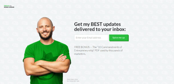
Free chapter
Read Chapter 1 of CITED, free.
The playbook for getting your business recommended by ChatGPT and AI search. Read the first chapter, on me.
Read Chapter 1 freeWant us to do this for your site?
Book a free AI audit. 15 minutes. We’ll show you three things your site is missing and what we’d test first.
Book my free AI audit →