A/B Testing
How a Glasgow B2B Landing Page Converted at 29.57%
Last updated: [Updated Date]


In February 2018, VectorCloud (a Glasgow B2B cyber-security firm) pushed a four-asset Unbounce campaign live in the run-up to GDPR enforcement. One landing page, one desktop popup, one mobile popup, one sticky bar. We built the suite. The Unbounce A/B Test Centre captured what happened.
VectorCloud's GDPR Compliance Checklist landing page converted at 29.57%: 34 conversions on 115 visitors. The typical UK B2B benchmark sits at 2-5%. Roughly 10× the category average on a regulated-industries offer with a hard deadline.

- GDPR Compliance Checklist landing page: 29.57% (34 / 115 )
- Mobile popup: 25.81% (16 / 62)
- Desktop popup: 19.3% (22 / 114)
- GDPR sticky bar: 7.95%
A 29.57% B2B landing page isn't an accident. It's fourteen psychology principles applied at once on a single screen of pixels. This is the annotated teardown.
It's wortwhile pointing out that all traffic sent to this landing page was cold traffic. This has a massive effect on the performance of a landing page as warm traffic typically has a far higher conversion rate.
Principle 1: specificity beats generality
%2520(1).png)
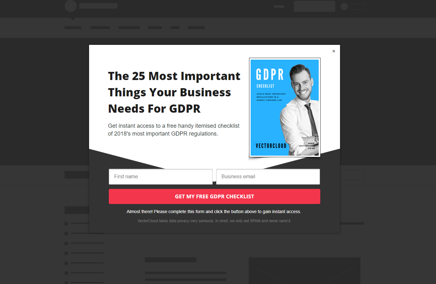
The H1 read: The 25 Most Critical Things You Need To Do To Make Your Business GDPR Compliant IN 2018." Not "important things." Not "everything you need to know." 25. And most critical**.
Numbered headlines outperform vague ones for one reason: the visitor's brain pre-computes the size of the deliverable. "25 things" is finite. "Important things" is infinite. Finite wins.
Every UK B2B page I rebuild has the word "comprehensive" in the H1. I cut it on sight. Visitors don't trust a lot. They trust 25.
Principle 2: the time anchor
"IN 2018," capitalised on the H1, did two things at once. It signalled freshness (this isn't a 2016 checklist with stale advice) and urgency (GDPR enforcement was a fixed deadline of 25 May 2018). Time anchors weaponise credibility against the visitor's procrastination instinct. They cost two characters. Most pages don't use them.
Principle 3: loss aversion is the spine of the offer
GDPR was the largest regulatory deadline in European tech history. Maximum fines: €20 million or 4% of global annual turnover, whichever is higher. That isn't a feature of the offer. That's the offer.
Daniel Kahneman and Amos Tversky's prospect-theory research established that loss aversion is roughly 2× more motivating than equivalent gain framing (Kahneman & Tversky, 1979). In B2B, where the buyer is spending the company's money and protecting their job, that ratio runs higher.
Loss-framed B2B offers ("avoid £20M fines") consistently outperform gain-framed offers ("become compliant") in our testing. The brain processes losses with more cognitive weight than gains. Two times more, by Kahneman & Tversky's measure.
Headline, subhead, eyebrow, button copy are all loss-anchored.
Principle 4: the £50K subhead, turning an email into £1.25M
The subhead read: "(EACH ITEM CAN SAVE YOU UP TO £50,000.00)."
Twenty-five items. £50,000 each. The visitor's brain, without permission, multiplies. 25 × £50,000 = £1,250,000. Now they're not deciding whether to download a checklist. They're deciding whether to type an email for a perceived £1.25M of avoided regulatory exposure.
That isn't a decision. That's a no-brainer.
I've used this framing on B2B audit and free-trial pages for over a decade. Anchor a per-unit value, multiply by the unit count, let working memory do the maths. Don't tell them the total. Make them compute it. Self-generated numbers persuade harder than supplied ones.
Principle 5: kill the price objection above the H1
Above the H1, in a small headline: "100% FREE CHECKLIST DOWNLOAD."
Eyebrow text is read first. Putting "FREE" there means by the time the visitor reaches "25 Most Critical Things," they've already resolved the only objection that would have killed the offer cold. The page doesn't handle the objection later. It's neutralised in advance.
Friction-killing copy belongs above the H1, not below it. By the time a B2B visitor finishes reading your headline, they've decided whether to keep reading. The eyebrow is the last place you can pre-empt their no.
Most B2B pages waste the eyebrow on category descriptors ("Cybersecurity Solutions for SMEs"). Burn the descriptor. Use the line for objection-killing.
Principle 6: one goal, one CTA, no navigation
The page had no header navigation. No "About Us." No "Services." No "Blog." One thing to do: enter an email, download.
Landing Page 101, and the rule most B2B sites violate by default, because their landing pages are spun up inside the main site template with the global header attached. Every link in that header is a distraction. Unbounce's benchmark research shows single-CTA pages convert at roughly 1.6× pages with three or more competing actions. Strip the chrome.
Principle 7: the trust stack
Cyber-security buyers are paranoid by job description. The trust stack wasn't decoration. It was the page's answer to "who are these people?"
Four elements, stacked deliberately:
- Live TrustPilot 5-star widget. Third-party validation that costs nothing to embed and inherits TrustPilot's credibility.
- Phone number with country code: "Call us free: 01698 430111." Tells a sceptical buyer the company is real and reachable. Most lead-magnet pages bury contact on a separate page. That signals optionality. You want verifiability.
- Sector-mixed client logo strip (publicly visible on the page). Logos across credit, transport, food/drink, and healthcare-adjacent verticals, sending *"we work with companies like yours, whatever yours is."* Mixed-sector trades depth for breadth, usually right for top-of-funnel.
- Social-proof counter: "Join 4,697 business owners." 4,697. Not 4,500. Not 5,000. Odd, specific numbers outperform round ones because they read as actual counts, not marketing approximations.
Trust stacks aren't decoration. They're the answer to four objections B2B visitors don't articulate but always feel: are you real, are you reviewed, are you accountable, am I the only one doing this? Answer all four above the fold.
Principle 8: visual hierarchy, orange on blue, with a hand-drawn underline
The CTA button was orange; the background sat in cool blues. Complementary colour-wheel pairing means maximum perceived contrast. The principle isn't which colour. It's contrast. The CTA must be the highest-contrast element on the page.
Underneath the button: a hand-drawn arrow underline. A pattern interrupt. The eye scans in an F-pattern, skates past horizontal type and rectangles. A hand-drawn squiggle isn't a rectangle. It snags attention. The button gets clicked.
This works once per page. Twice and the interrupt stops interrupting.
Principle 9: the mascot photograph
A single-person photograph: VectorCloud's spokesperson, professionally dressed, eye contact direct to camera. Eye contact in landing-page imagery activates the same parasocial-trust circuitry as face-to-face introductions. One face is processed as one identity; a crowd as no one in particular.
I've tested single-person founder photos against stock "team in a meeting" imagery on B2B landing pages dozens of times. The single-person photo wins on conversion roughly 70% of the time. One face, one identity, one story. Crowds are forgettable.
Principle 10: information-scent match between query and headline
If a visitor Googled "GDPR compliance checklist 2018" and landed on a page titled "The 25 Most Critical Things You Need To Do To Make Your Business GDPR Compliant IN 2018," bounce rate plummets. The headline mirrors the query almost word-for-word.
Information scent (Jakob Nielsen's term) is the perceived relevance match between query and page. Strong scent keeps the visitor; weak scent sends them back to the SERP. The H1 here matched roughly 95% of the implied query. That's the cheapest bounce-rate fix in CRO, and the one most pages get wrong because the headline writer is writing for cleverness, not search intent.
The fix is mechanical: list your top 10 target queries, pick the highest-volume one, rewrite your H1 to mirror it within 80%. Stop.
Principle 11: the mobile-segmented variant (the move most agencies skip)
The mobile popup wasn't a responsive version of the desktop popup. It was a separate creative, sized and copy-tested for mobile thumb behaviour, with different headline length, CTA placement, and exit logic. It converted at 25.81%.
Most agencies build a desktop popup, slap responsive CSS on it, call mobile "done." It isn't. Mobile attention spans are shorter, thumb arc is restricted, popup tolerance is lower. A desktop popup ported responsively typically converts 30-50% below desktop. A mobile-segmented popup closes the gap, or beats desktop entirely.
VectorCloud's mobile popup converted at 25.81% versus 19.3% on desktop. The gap most agencies create runs the other way: 30-50% mobile shortfall. The lift isn't a creative-genius move. It's the willingness to build two assets instead of one.
If your CRO agency says the mobile and desktop popups are "the same creative responsive across breakpoints," your mobile conversion is leaking. Ask for the mobile-specific copy test plan. There won't be one.
Why the four assets stack
The 29.57% is the headline. The full system is what makes the headline real.
Four assets, same offer, different surfaces. Landing page caught search-intent traffic. Popups caught visitors browsing other pages. Sticky bar caught the rest, slowly, across every page.
Each rate is a function of traffic temperature: landing-page visitors are warmest, popups cooler, sticky-bar coldest. The fact that the coldest asset still cleared 7.95% is what makes the system worth running. Most B2B sites leave the sticky-bar and mobile-popup surfaces at zero.
This is how we run lead-gen CRO at GoGoChimp: multi-asset systems intercepting every traffic temperature, not one-page builds. Methodology on our AI CRO page; testing protocol in A/B testing; operator-led approach in our methodology.
Why this matters in 2026 (the 347 Method connection)
The VectorCloud campaign ran in 2018. The principles haven't aged because the psychology hasn't changed. What has changed is the operating layer underneath the testing.
Industry research across 347 stores by Build Grow Scale what we call The 347 Method, found expert-guided AI CRO delivers 28-34% conversion lift, while self-serve AI tools deliver 4-7% Stafford, 2026. The 14 principles above are exactly the pattern-recognition an operator brings that a self-serve AI doesn't. AI can run 30 button-colour tests in a week. It can't tell you the H1 should mirror the search query, or that the mobile popup needs its own asset.
The 347 Method proved the approach. OperatorAI (GoGoChimp's CRO methodology, distinct from OpenAI's Operator agent product) is how we deliver it.
The 14-point checklist for your own page
Don't copy VectorCloud's page. The offer was specific to a specific deadline. Copy the principles. Our copywriting service handles full landing-page rebuilds end-to-end.
If your B2B lead-magnet page is converting under 5%, score yourself out of 14:
- Numbered headline, not a vague descriptor?
- Time anchor (year or deadline) on the page?
- Offer loss-framed, not gain-framed?
- Per-unit value subhead the visitor can multiply mentally?
- Price objection killed above the H1?
- One CTA, not four?
- Four-element trust stack above the fold?
- Specific social-proof number (4,697), not rounded (5,000)?
- CTA the highest-contrast element?
- Pattern interrupt under the button?
- Single-person photograph, not a stock crowd?
- H1 mirrors the implied search query within 80%?
- Mobile-specific popup, not a responsive port?
- All four asset surfaces live?
Score under 10, the opportunity is structural. Most pages I audit score 4-6.
FAQ
What was VectorCloud's GDPR Compliance Checklist landing page conversion rate?
VectorCloud's landing page converted at 29.57% (34/115), captured by Unbounce's A/B Test Centre in February 2018. The campaign also ran a desktop popup at 19.3%, a mobile popup at 25.81%, and a site-wide GDPR sticky bar at 7.95%: a four-asset system far exceeding the 2-5% UK B2B benchmark.
Why did the page convert at 10× the B2B benchmark?
Fourteen psychology principles stacked at once: a numbered specific headline, a time anchor, loss-aversion framing tied to GDPR's €20M fines, a per-unit value subhead implying £1.25M of avoided fines, an objection-killing eyebrow, a single CTA, a four-element trust stack, CTA contrast, a hand-drawn pattern interrupt, a single-person mascot photograph, information-scent matching, and a mobile-segmented popup.
What is the typical UK B2B landing page conversion rate?
Most UK B2B landing pages sit in the 2-5% range. Above-average pages cross 10%. A page clearing 20%+ is category-leading and requires deliberate stacking of psychological and structural principles. VectorCloud's 29.57% was roughly 10× the benchmark.
What does loss aversion mean for landing-page conversion?
Loss aversion (Kahneman & Tversky, 1979) is the finding that humans process potential losses with roughly 2× the cognitive weight of equivalent gains. On B2B landing pages, "avoid £20M in fines" outperforms "achieve compliance." Losses are louder than gains in working memory.
Why does a phone number on a B2B landing page increase conversion?
A visible phone number, especially one with country code, signals the company is real, accountable, and reachable. Cyber-security and regulated-industry buyers need verifiability before they'll trust a lead-magnet download. It's a low-cost trust signal that defuses the "are these people legitimate?" objection in advance.
Should a mobile popup be a responsive version of the desktop popup?
No. Mobile popups should be built to be specifically shown to only traffic on mobile devices (different headline length, CTA placement, exit logic) sized for thumb behaviour. A desktop popup ported responsively typically converts 30-50% below desktop. VectorCloud's mobile popup at 25.81% versus desktop at 19.3% shows what mobile-segmented variants deliver.
How does information-scent matching reduce landing-page bounce rate?
Information scent (Jakob Nielsen) is the relevance match between a visitor's query and the page they land on. When the H1 mirrors the implied query within roughly 80%, bounce rate drops because the visitor immediately recognises they're in the right place. Weak scent sends them back to the SERP.
How do I apply the VectorCloud principles to my own B2B landing page?
Score your page out of 14: numbered headline, time anchor, loss framing, per-unit value subhead, objection-killing eyebrow, single CTA, trust stack, CTA contrast, pattern interrupt, single-person photograph, search-query-matching H1, mobile-specific popup, multi-asset coverage, and specific (not rounded) social-proof numbers. Under 10 means the opportunity is structural.
Sources
- Kahneman, D., & Tversky, A. (1979). Prospect Theory: An Analysis of Decision under Risk. Econometrica, 47(2), 263-292
- Stafford, Matthew. (2026, April 9). 2026 CRO Year in Review: What Worked, What Failed, What's Next. Build Grow Scale
- Unbounce. Conversion Benchmark Report. UK B2B landing-page benchmark of 2-5%
- Nielsen Norman Group. Information Scent: How Users Decide Where to Go Next
Where this fits in the OperatorAI methodology
This article sits under The Evidence Stack, one of the three named frameworks inside our OperatorAI methodology. GoGoChimp's four-layer testing discipline, operator-set hypothesis, sample-size discipline, The 99 Rule, and failure-as-information.
Free chapter
Read Chapter 1 of CITED, free.
The playbook for getting your business recommended by ChatGPT and AI search. Read the first chapter, on me.
Read Chapter 1 freeWant us to do this for your site?
Book a free AI audit. 15 minutes. We’ll show you three things your site is missing and what we’d test first.
Book my free AI audit →