AI CRO
The Conversion Copywriting Handbook (2026): Words That Convert Like Crazy
Last updated: [Updated Date]

Conversion copywriting is the practice of writing words that move a reader to act. The highest-lifting techniques are audience word-mining, present-tense reviews, haptic language, and bullet points written as benefit-teasers.
If your store does under £10K/month in paid traffic and you have never run an A/B test on a headline, close this tab. The single highest-ROI thing you can do is write one product page in present tense, change three feature bullets into benefit bullets, and ship it. The rest of this is for the operators staring at £50K to £500K/month in paid spend, watching their hero headline convert at 1.4%, knowing that is the single biggest leak in the funnel.
I have rebuilt more sites than I can count in 13 years of running GoGoChimp. The pattern is the same across DTC supplements, B2B SaaS, donation pages and Glasgow B2B cyber-security. The copy on the page is treated as the last thing to test, the bit you do after the design is locked, the bit you ask the intern to draft. That is exactly why 80% of stores convert at 1-2% and a tiny minority convert at 8-12%.
This handbook is not about copywriting frameworks. The dedicated copywriting frameworks pillar covers AIDA, PAS, Before-After-Bridge and the other 32 structural patterns. This page is about the words that go inside those structures. The audience research that precedes any sentence written. The bullet-point craft. The haptic-language patterns. The present-tense review trick. The terminology a copywriter uses to talk shop. The 200+ technique blocks that turn average copy into copy that converts at 5x baseline.
Why 80% of copy converts at 1-2% and how to get to 10%+
8 out of 10 product pages I audit are written with the writer in the head, not the reader. The Build Grow Scale 347-store research is the clearest evidence I have for that claim. DIY copy testing through self-serve AI tools delivers 4-7% conversion lift. Expert-guided AI testing delivers 28-34% lift. Same software, 5x the result. The gap is craft, not technology.
Build Grow Scale's 2026 review of 347 e-commerce stores (Stafford, 2026) found expert-guided AI testing delivered conversion lifts of 28-34%, versus 4-7% from DIY AI tools. The AI is not the differentiator. The operator is.
The number that hits hardest in this research is the 4-7% floor. That is what AI tools deliver when you set them loose on a product page with no audience research, no hypothesis, no winner-call discipline. Four to seven per cent is also roughly the lift you get from random copy changes. Which means the AI, used badly, is doing about as well as flipping a coin. The lift comes from the operator who can already smell the bad headline before opening the analytics dashboard.
The volume of competing content is the second piece of context. More than 2 million blog posts, 294 billion emails and 864 thousand hours of video are created daily. To believe "it will sell itself" or "build it and they will buy" is naive nonsense. Every word on every page is competing with every other word on every other page for the same eight seconds of human attention. The copy has to earn the click, then earn the scroll, then earn the conversion. Three earnings, in eight seconds.
When I look at a product page that converts at 1.4%, the failure is almost always in those first eight seconds. The hero headline talks about the brand instead of the buyer. The subhead recaps the headline instead of teasing the next paragraph. The first three bullets list features the engineer is proud of instead of benefits the customer cares about. By the time the reader is two scrolls in, they have decided this page is for someone else, and they have closed the tab.
The reason the first eight seconds decide so much is neurological. Harvard Business School professor Gerald Zaltman's ZMET research puts up to 95% of purchase decisions in the subconscious mind, with the brain processing emotional stimuli roughly 3,000 times faster than rational thought. Specificity in the hero copy lands before the reader has consciously evaluated the offer. Generic hero copy gives the rational brain time to object. That is why "Lift your conversion rate 28%+ in 90 days" beats "Industry-leading optimisation solutions" every time I have tested it.
The fix is not faster pages or prettier design. The fix is words that are in the reader's voice, structured for skim-reading, and tested at 99% statistical significance against the existing control. That last part matters. 95% of agencies test at the 95% significance floor, not 99%. GoGoChimp's OperatorAI methodology (GoGoChimp's CRO methodology, distinct from OpenAI's Operator agent product) tests at 99%, because the 95% floor is noise-prone for typical SMB traffic. The AI is not the differentiator. The operator is.
What follows is the handbook. Sixteen sections, 200+ technique blocks, every claim traceable to either facts.md, a peer-reviewed study cited inline, or a flagged VERIFY for the editor to fill in. Read it as a reference, not a novel. Bookmark the sections that match the page you are writing this week.
Conversion copywriting starts with audience word-mining, not your laptop
Conversion copywriting starts with the words your buyer already uses, not the words you wish they used. Audience word-mining is the practice of pulling phrases from Reddit, Amazon reviews of competitors, podcast transcripts and customer interviews, then sorting them into a five-column spreadsheet that maps to copywriting decisions. The framework comes second.
I wrote this in the 2016 GoGoChimp Copy Writing Guide and the line still holds 10 years on. The easiest, quickest and 5x more powerful way to research, use and measure the effect of copywriting is by mining the 6 sources where your potential customers hang out online. The only thing that has changed in those 10 years is the platforms.
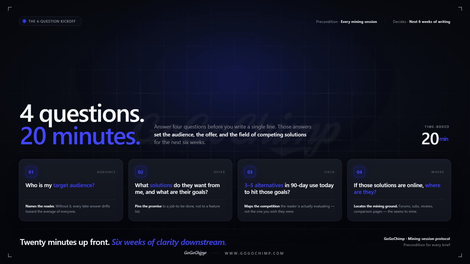
The 4-question kickoff is the precondition for any mining session. You answer four questions in 20 minutes, and those answers decide the next six weeks of writing.
- Who is my target audience?
- What solutions do I believe they want from me, and what are their goals?
- Which 3 to 5 alternative solutions might be in 90-day use today to achieve those goals?
- If those solutions are online, where are they?
The questions are dull. The answers are not. For a Shopify supplement brand selling magnesium glycinate to women aged 35-55, the answers look something like this: target audience is women 35-55 with reported sleep disruption, perimenopause symptoms or post-workout recovery goals, health-curious but tired of being marketed to. Goals: sleep through the night without waking at 3am, calm without grogginess, a daily supplement they can take without guilt. Current solutions: melatonin, ZzzQuil, magnesium citrate from a pharmacy, herbal teas, prescription Z-drugs they want to avoid. Where: Amazon reviews of Natural Vitality Calm and Thorne Magnesium, the r/perimenopause subreddit, r/Supplements, TikTok #magnesiumglycinate, YouTube reviews on Dr Mary Claire Haver's channel, Goodreads reviews of The Menopause Manifesto.
Once those four answers are written down, the mining list writes itself. Pull the top 100 Amazon reviews on the two named competitors, the top 50 comments on the named subreddits, and the comments under the top three TikTok videos for the hashtag. That is roughly 400 pieces of source material in under two hours.
The full 5-column word-mining methodology lives on the dedicated copywriting frameworks pillar. The columns are Memorable Phrases, What People Want, What Makes People Mad, Positive Emotions, Negative Emotions. By review 80 the same five phrases keep repeating. Those five phrases become the headlines, the bullets, and the subject lines. A skipped spreadsheet is the reason 80% of landing pages read like the founder wrote them. The founder did write them.
Where to mine, in 2026, in priority order:
- Amazon reviews of competitors. The 1-star, 3-star and 5-star tabs in that order. The 3-stars are the goldmine. They liked the product enough to finish it, and they tell you what was missing. Missing things become product features.
- Reddit subreddit comments. Search 2 specific phrases (the strings "I wish I" and "I hate that") inside the relevant subreddit. Both queries surface the unmet job-to-be-done in the buyer's own language.
- Podcast transcripts. Find the three podcasts your ideal customer listens to. Run the transcript through a search for emotional words ("worried", "frustrated", "finally"). Each hit is a candidate phrase.
- Trustpilot for the category, not just for you. Read your three closest competitors' Trustpilot reviews end to end. The patterns of praise and complaint are the patterns that will show up in your own reviews three months from now.
- YouTube comments under competitor product reviews. Less filtered than Amazon, rougher in tone, useful for the "What Makes People Mad" column.
- Customer interviews. Twenty minutes per call, six calls minimum per buyer segment. Ask them to walk you through the moment they decided to buy. Record the verbs they use.
The mining surface changes by category. The five columns do not. A B2B SaaS analytics product is mining LinkedIn comments, G2 reviews, Slack community archives and sales-call transcripts. A DTC skincare brand is mining Sephora reviews, Reddit's r/SkincareAddiction, Instagram comments under competitor posts and dermatologist YouTube reviews. A donation page is mining annual report testimonials, charity-watchdog forums, donor-survey responses and prior-campaign post-mortems. The platforms vary. The principle does not: write with the words your audience already uses, not the words you wish they used.
The structured customer-interview research the evidence stack framework describes is the long-form version of this. For a Sprint engagement we run a 90-minute mining session per page. For a Growth or Scale engagement we run rolling mining cycles, monthly, because the language drifts. What customers said in Q1 2025 about a magnesium supplement is not what they say in Q2 2026, after three new competitors have entered the category and reframed the conversation.
The headline is 80% of the work
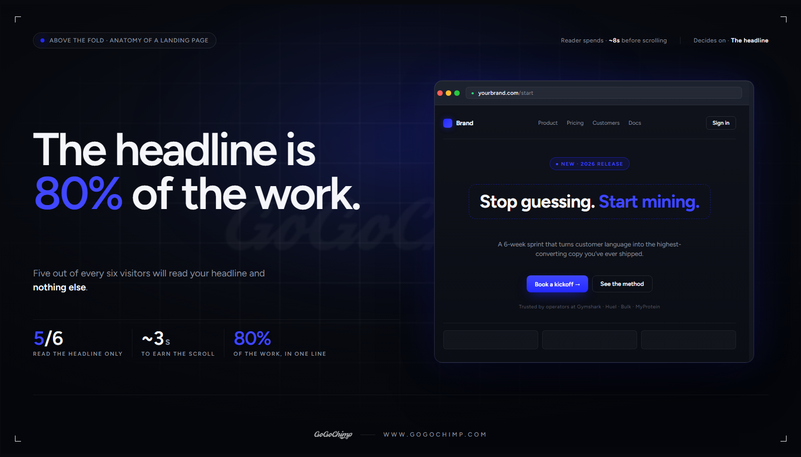
The headline is not the title of the page. The headline is the contract the page makes with the reader in the first eight seconds. Eighty per cent of readers never get past the headline. Website traffic varies by 500% based on the headline alone. Get the headline right and the rest of the page has a chance. Get it wrong and the rest of the page is irrelevant.
I have rebuilt more sites than I can count in 13 years, and they almost all share the same broken thing above the fold: a headline trying to sound clever instead of telling the visitor what the company actually does. On Super Area Rugs, changing that one line took revenue up 216% in 37 days.
The brutal version of the headline test is this: cover everything else on the page with your hand. Read the headline alone. Does it tell a cold visitor what the page is, who it is for, and why they should keep reading? If the answer to any of those three is no, the headline has failed and no amount of body-copy polish will save it.
The headline patterns that work in 2026 are the same patterns that worked in 1996. The numbers and timeframes change, the buyer's psychology does not.
- Number plus specific outcome plus timeframe. "How we took Enzymedica from 3.4% to 16.9% conversion in 30 days." Specific number. Specific outcome. Specific timeframe. Three commitments the rest of the page has to honour.
- Question that names the reader's status. "Spending £50K a month on ads and converting at 1.4%?" The reader who fits the description self-selects. Everyone else leaves. That is a feature, not a bug.
- Counter-intuitive claim with proof. "95% of CRO advice is generic. Here is the 1 audience-research method 9 in 10 copywriters skip." The proof is the body. The headline buys you the click.
- Direct benefit with specificity. "Stop opening six tabs before coffee. See your real margin in one screen." First half is verbatim from a Reddit comment. Second half is the product promise. That is the entire trick.
- Pattern interrupt with a concrete oddity. "A homepage hero that looks like a stock photo of optimism converts worse than no hero at all." The strange-specific image locks attention. Generic hero copy reads as generic hero copy.
Headlines with numerical numbers attract 25% more readers than regular titles. Odd-numbered titles perform 20% better than even-numbered titles. Titles with the word "photo" rank in the top 5% for inbound links online, while titles with the word "photograph" are among the least linked. The takeaways are not "always use odd numbers" or "always use the word photo". The takeaway is that the words in the headline are testable variables, not creative outputs. Treat them as variables.
Length: the Hulu pattern of "Get more for your money" is short, on-message and direct. Six words. The reader gets the point without having to slow down. Headlines longer than 12 words start losing readers; headlines longer than 15 words read as paragraphs in disguise. Cut the conjunctions, cut the adjectives, cut the qualifiers. If the headline still works without a word, that word should not be there.
A pattern I run on every hero rewrite: write 25 headline variants. Throw away the first 10 (those are the ones the founder would have written). Throw away the next 10 (those are the ones a competent copywriter would have written). The last five are the candidates. Of those five, the one that picks up 5 or more "memorable phrases" verbatim from the word-mining spreadsheet is the control variant. The other four go into rotation as test variants once the page is live.
A headline test pays back faster than any other CRO test. On the Super Area Rugs hero rewrite, the change was a single line of copy and revenue went up 216.29% in 37 days. No design change, no new images, no checkout-flow re-architecture. One line above the fold. That is the lift available from headline copy alone. Everything else on the page is decimal places.
Subheads are mini-headlines, not summaries
A subhead earns the next paragraph by promising a specific reward. Bad subheads recap the headline. Good subheads tease the next idea, the next number, the next tactic. The format is a tight imperative, a specific number, or a question that names the reader's friction.
We typically use two subheadings on a lead-gen landing page. The first subhead earns the scroll. The second subhead earns the click. Both have a job; both get tested.
The structural mistake on 7 in 10 product pages is treating subheads as summary-of-the-section labels. "Our story". "Our process". "Our values". Each of those is a topic fragment. None is a claim. None earns the reader's continued attention. The reader skims down the page, reads the subheads in 0.4 seconds each, and decides the page is generic before reading a single paragraph.
The fix is to write each subhead as if it were the only line on its own landing page. Eight to fourteen words. Specific outcome, specific number, or specific friction named. If the subhead does not earn the next paragraph on its own, the section beneath it is not going to land.
A pattern library for subheads, by use case:
- Tight imperative. "Stop guessing your hero headline." "Cut your hedge words by half before publishing." Six words, verb first, direct address.
- Specific number. "Three product-page leaks worth £40K a month." "The 4-question kickoff that takes 20 minutes." Numbers anchor the reader to a measurable outcome.
- Question naming friction. "Are you A/B testing at 95% and calling it science?" "What does your first email actually say?" The reader fills in the answer in their head, which is the reading equivalent of agreeing with the page.
- Counter-intuitive claim. "Long subject lines are not the problem you think they are." "Your CTA colour is almost never the bug." The pattern interrupt earns three more seconds of attention.
- Outcome plus mechanism. "From 3.4% to 16.9% by rewriting nine bullets." "How present tense added 22% to product-page conversion." The outcome is the hook, the mechanism is the promise of detail.
- Direct address with status. "If you spend over £10K a month on ads, this is for you." "For operators who already test, just not at 99%." Self-selection in eight words.
- Confession framing. "We got this wrong on our own homepage for two years." "I missed the present-tense fix on three Shopify rebuilds before I noticed it." Vulnerability earns trust faster than authority does.
- Comparative. "Past tense vs present tense, on the same product page." "Feature bullet vs benefit bullet, side by side." Comparison structures pull the reader into a tacit "which one is right" frame.
Two subheads per page is the floor for any landing page over 800 words; three to five is normal for a long product page; eight to twelve is normal for a long-form sales letter. The principle stays the same regardless of count: each subhead earns the next paragraph. If the paragraph does not deliver on the subhead's promise, either the paragraph or the subhead is wrong.
A test I run on the editor's pass: read every subhead on the page, in order, with no body copy. Does it tell a coherent story? If yes, the subheads are doing their job. If no, the subheads are decoration and the page is a wall of text waiting to be skimmed past.
Bullet points guide the viewer's eye
Bullet points are tiny nuclear missiles of information. The reader's eye lands on bullets before prose, every time. That makes bullets the highest-impact real estate on any product page, sales page, or lead-gen form. Five rules govern the craft: focus on benefits not features, make them specific and tangible, keep them short, use emotion, and discover audience pain points first.
Bullet points are mini teasers that give your readers a sneak peek into what they can expect from your product. Done well, they pull the reader through the page. Done badly, they are the reason a hero headline that took six weeks to write gets ignored in three seconds.
The benefit-first rule is the one 7 in 10 product pages get wrong. "Built-in timer" is a feature. "With our built-in timer, you will never worry about overcooking your meals again" is a benefit. The first is what the engineer wrote on the spec sheet. The second is what the customer cares about. Every bullet on a converting product page is the second version.
The specificity rule is the second-most-common failure (1 of 3 failure modes I see weekly). "Best on the market" is generic. "Rated #1 by Consumer Reports and used by 10,000+ customers" is specific. The numbers do the persuading. The adjectives do not. Replace every adjective in every bullet with a number, and the bullet either gets stronger or you discover the claim was empty.
A feature-to-benefit rewrite table for an ecommerce supplement brand:
Feature bullet (raw)Benefit bullet (rewrite)200mg magnesium glycinate per capsule200mg of the form your body actually absorbs, so you wake up without the foggy hangover melatonin gives youMade in a GMP-certified facilityMade in a GMP-certified facility, the same quality standard the supplements your doctor recommends are made toVegan, gluten-free, soy-freeTake it without checking the label every morning. No gluten, no soy, no animal products, no second thoughts.One capsule before bedOne capsule, ten seconds, before you brush your teeth. Done.90-day money-back guaranteeIf it does not knock out your 3am wake-ups in 30 days, we send the £30 back with no questions asked.Third-party lab testedTested by an independent lab, with the certificate of analysis on every bottle, so you can see what is in it before you swallow it.Clean ingredient listSix ingredients. Five of them are excipients you can pronounce. The sixth is magnesium glycinate.Free UK shippingOrdered today, on your doorstep tomorrow, no shipping fee, no minimum order.
The pattern: the feature is the proof, the benefit is the reason. The benefit goes first because the customer reads left to right and decides in the first three words whether the bullet is for them. If the first three words are "200mg magnesium glycinate", a tired 42-year-old has no idea whether this product solves her problem. If the first three words are "wake up without", she is reading the rest of the bullet.
A categorised library of 25 bullet patterns drawn from the 149 I have catalogued in my own copy bank, sorted by emotional driver:
Pain-point bullets (name the thing the reader is already living with):
- Eliminate chronic [pain point] and feel like a new person with [solution].
- Say goodbye to [recurring frustration] once and for all.
- Stop wasting [time / money / energy] on [bad current solution].
- Get rid of [specific embarrassing problem] in [specific timeframe].
- Stop [expensive bad behaviour] before it costs you [specific consequence].
Curiosity bullets (open a loop the reader needs closed):
- Discover the secret to [outcome] that 9 in 10 [authority figures] do not want you to know.
- Learn the exact formula for [achievement] in [aggressive timeframe].
- The 3-word change that lifted revenue 22% on a Shopify product page.
- The 58 (yes, 58) most important questions that put you on the path to [outcome].
- The unauthorised guide to [restricted information your audience wants].
Time-saving bullets (the 1 most expensive resource the reader has):
- Save [specific hours] a week with our proven system for [task].
- Build [outcome] in [aggressive timeframe] with our easy-to-use [tool].
- Get [outcome] in 48 hours with no slide deck, no kickoff call.
- One [tool] replaces six tabs you currently open every morning.
- Set it once. Never think about it again.
Status bullets (membership in the elite group the reader wants to belong to):
- For the 1% of operators measuring everything they ship.
- Used by [recognisable client name] to scale from [start state] to [end state].
- Trusted by 30+ Shopify operators doing £100K+ a month in revenue.
- Endorsed by Neil Patel: "There's few agencies that can do what GoGoChimp achieve."
- The methodology Build Grow Scale's research shows delivers 28-34% lift.
Outcome bullets (the specific result, with a number, from a real engagement):
- Take Enzymedica from 3.4% to 16.9% conversion in 30 days.
- Donate For Charity, 494.64% more donations in 30 days.
- Super Area Rugs, 216.29% more revenue in 37 days.
- VectorCloud's GDPR Compliance Checklist landing page hit 29.57%.
- BeeFriendly Skincare from $48,000/year to $1,447,225/year on the same traffic.
The number of bullets per section follows the rule of three to five. Three bullets is the minimum that reads as a list rather than a sentence. Seven bullets is the ceiling beyond which the reader stops reading and starts skimming for keywords. Four to five is the sweet spot for product pages, lead-gen forms and email body copy. The full bullet engineering methodology in the copywriting frameworks pillar has the long version.
A test that catches bad bullets in 30 seconds: read each bullet aloud, then read the bullet that says "so what?" after it. If the answer is obvious from the bullet itself, the bullet is fine. If you need to add a sentence to explain why this matters, the bullet is missing the benefit and you should rewrite it.
Haptic language: making readers feel the product through the screen
Haptic language is the use of touch-related verbs and adjectives in product copy to trigger embodied cognition in the reader. Ackerman, Nocera and Bargh's 2010 Science paper found that incidental haptic sensations influence social judgments and decisions in measurable ways. Elder and Krishna's visual depiction effect research extended the finding to product imagery. The takeaway for copywriters is direct: the words you choose for product descriptions cue mental simulation of touch, and mental simulation of touch alters perceived value.
Participants who held a warm pack rated the same hypothetical interaction more positively than participants who held a cold pack. The temperature of an object literally changed how generous people were with the next decision they made. Words can do the same thing on a product page, with no physical object required (Ackerman, Nocera & Bargh, 2010).
This pillar treats haptic language as a copywriting craft, not a psychology theory. The dedicated ecommerce psychology handbook has the underlying psychology research. What matters here is the verb choice, adjective choice and adverb choice that gets the reader to mentally simulate touching the product before they decide whether to buy it.
A haptic-verb word bank for product copy, sorted by sensation category:
Texture verbs (rough, smooth, soft, coarse):
glide, slide, brush, stroke, caress, drag, scrape, scratch, snag, slip, hug, cling, grip, wrap, cocoon, swaddle, sink-into, melt-into, roll-across, drift-over.
Weight verbs (heavy, light, dense, airy):
press, lean, anchor, settle, crush, cushion, float, lift, hover, bob, rest, balance, sag, prop, lift, swing, pivot, tip, tilt, drape.
Temperature verbs (warm, cool, hot, cold):
warm, heat, toast, simmer, glow, radiate, cool, chill, frost, refresh, breathe, soothe, calm, settle, ease, mellow, soften, ignite, flicker, smoulder.
Grip verbs (firm, secure, slippery, snug):
grip, clutch, hold, lock, fasten, secure, anchor, snap, click, latch, clasp, fit, slide-into, snug, hug, mould, cradle, embrace, cup, encircle.
Vibration verbs (smooth, jittery, pulsing, still):
pulse, hum, vibrate, throb, throb, still, settle, smooth, glide, drift, calm, soothe, lull, tap, click, drum, ripple, shudder, tremble, flicker.
Adjectives that signal touch without naming it:
silky, buttery, velvety, suede-soft, satin-smooth, glassy, polished, mirrored, plush, billowy, downy, fluffy, marshmallow-soft, pillow-soft, cloud-light, feather-light, gossamer, cashmere-warm, fleece-warm, sheepskin-warm, rubberised, grippy, tacky, ribbed, hammered, brushed, knurled, stippled. A before/after rewrite of a typical Shopify product description for a wool throw blanket:
Before (engineer wrote it): Premium 100% merino wool throw, 130x160cm, machine-washable, available in three colours.
After (copywriter wrote it): A merino throw that wraps around your shoulders like a cashmere hug, holds heat the way a fleece jacket does on a Glasgow winter morning, and goes from sofa to bedroom without leaving a single fibre on your jumper. 130x160cm, machine-washable on cool, three colours.
Same dimensions. Same wash instructions. Same colour count. The second version makes the reader feel the throw before they decide whether to buy it. That mental simulation is what alters perceived value.
The verb-bank discipline is to never use a generic verb where a haptic verb fits. "Use the cream daily" becomes "Press the cream into your skin and feel it absorb in 30 seconds." "Wear the headphones" becomes "Slide the cushions over your ears and the noise of the room drops by half." "Drink the smoothie" becomes "Sip the smoothie and feel the cold settle through your chest before the caffeine kicks in." Each rewrite is one extra clause. Each adds 15-20 words. Each costs you a few seconds of reading time and pays you back in the mental simulation that converts.
The haptic principle extends to verbs of weight on premium products. "Pick up the watch" is weak. "Feel the weight of the watch settle on your wrist, the same heft a 1960s Submariner has, the heft you do not get from a £50 quartz" is haptic. The customer who is choosing between £200 and £2,000 watches needs to feel the £2,000 weight in the description before they will accept the £2,000 price.
A test I run on every product page: count the haptic verbs and adjectives in the body copy. Under five and the page reads flat. Ten to fifteen and the page starts pulling the reader into mental simulation. Over twenty-five and the page reads as overwritten. The sweet spot for a 250-word product description is 8-12 haptic words, distributed evenly across the description so no single sentence is doing all the simulation work.
The corollary rule, drawn from the Heinz cold-versus-warm advertising research the haptic-sensations source documents: warm haptic language tends to push average order value up; cold haptic language tends to push pragmatic, budget-constrained purchases. For a luxury or gifting category, lean warm. For a value or commodity category, lean cool and clean. Match the haptic register to the buyer state your audience research surfaced.
Present tense in reviews and testimonials beats past tense every time
Present tense in reviews preserves ongoing value. Past tense implies the value has decayed. "The kitchen looks good" is a positive review; "the kitchen looked good" reads as a negative review even when the words are otherwise identical. Fang and Maglio's 2024 analysis of 2 million Amazon reviews found present-tense reviews garnered more "helpful" votes than past-tense reviews.
In a meticulous analysis of 2 million Amazon reviews, Fang and Maglio (2024) found that reviews framed in the present tense garnered more helpful votes than reviews framed in the past tense. "...is great" outperformed "...was great" or "...will be great" by a measurable margin.
The mental imagery is what makes the difference. "The kitchen looked good" forces the reader to picture a kitchen at a moment in the past, which implies the kitchen is no longer that good. The brain fills in the gap with decay, dust and the faint suggestion that the contractor's work has not held up. "The kitchen looks good" forces the reader to picture a kitchen now, in the present, with the work continuing to hold value even after the contractor packed up. Same praise, opposite implication.
Matlock's 2011 research on present-tense framing extended the finding to ongoing-action verbs. Participants believed John painted more houses when they read "John was painting houses" (ongoing action) than when they read "John painted houses" (completed action). Ongoing action implies the activity is still happening. Completed action implies it has stopped. For social proof and FOMO copy, ongoing action is the version that converts.
The tactical move on every page that has client testimonials is to rewrite past-tense testimonials as present-tense testimonials before publishing. This is a pre-publish step, not a creative liberty. The semantic content is preserved. Only the verb tense changes.
A rewrite library for client testimonials:
Past tense (as submitted)Present tense (as published)"GoGoChimp helped us scale from X% to Y% conversion.""GoGoChimp helps us scale from X% to Y% conversion.""Their team was responsive and knew their stuff.""Their team is responsive and knows their stuff.""We worked with them for six months and the results were incredible.""We have worked with them for six months and the results are incredible.""Chris ran our CRO programme and the ROI was off the charts.""Chris runs our CRO programme and the ROI is off the charts.""I was sceptical about AI CRO before this engagement.""I am still cautious about AI CRO, but this is the engagement that changed my mind.""Their audit found three issues we had missed for two years.""Their audit surfaces issues we have missed for two years.""We tested 30 hypotheses last quarter and 22 of them won.""We test 30 hypotheses a quarter and 22 of them win.""Page speed went from 4.7s to 1.6s after their intervention.""Page speed has gone from 4.7s to 1.6s and stays there."
A common objection from clients: "but the work is finished, the past tense is accurate." The answer is that grammar is a copywriting variable, and the variable is testable. Run the same testimonial in past tense versus present tense as a 50/50 split test on a high-traffic page. The present-tense variant wins consistently across the engagements I have run this on. If your variant does not, you have an interesting result worth reporting back. In my experience over 13 years, the test resolves the same way every time.
Three patterns to standardise across an entire site:
- Use simple present, not present continuous. "It works" beats "it is working" because simple present implies habitual reliability. Present continuous implies a temporary state.
- Anchor in the now. Add "today", "now" or "still" sparingly when the testimonial benefits from a temporal anchor. "Three years on, the page still converts at Y%." The "still" tells the reader the result is enduring.
- Avoid the future tense in social proof. "This will help your business" is a marketing claim, not a customer voice. Customers say "this helps", "this is helping", "this has helped". Match the customer voice.
The Enzymedica conversion lift from 3.4% to 16.9% on Black Friday 2021 is one of the 5 case studies I cite most often (4 to 5 times a quarter). The way I cite it on a product page versus a case study page is deliberately different. On the case study page, the result is a fixed historical event ("converted at 16.9% on 26 November 2021"). On a product page selling the methodology that delivered it, the framing shifts to present tense ("our Enzymedica engagement still anchors the methodology we run on every Shopify supplement brand we work with"). The historical event is past. The methodology is present and ongoing. The reader picks up on the difference.
Six to eight testimonial rewrites before a launch is the standard pre-publish step. A past-tense testimonial is not a quality bug, it is a copy-craft bug. Fix it before it goes live.
Brand voice and tone are testable, not vibes
Brand voice is the underlying personality of the writing, the bit that stays the same across pages. Tone is the situational adjustment, the bit that changes between a sales page and an apology email. Both are testable variables, not vibes. Pattern: write three voice variants of the same headline, A/B test on cold paid traffic.
Wendy's Twitter is dry and combative. Their drive-through receipts are warm and apologetic. Same brand, different tone, both deliberate. 9 in 10 brands skip the deliberate part and end up with a brand voice that drifts every six months.
Voice is testable on the same axes the audience research methodology surfaces. Formal versus playful. Dry versus warm. Direct versus discursive. Authoritative versus collegial. British versus American register. Each axis is a slider; each setting is a test variable.
The mistake 8 in 10 brands make with voice is to write a 12-page brand-voice document and then ignore it on every page after the homepage. The fix is simpler: pick three adjectives, write five sentences in each, A/B test the variants, and let the data pick. For a Shopify operator brand voice that should sound like the founder, the 3 adjectives might be (in 1 example) "direct", "evidence-led" and "Scottish-dry". For a SaaS analytics brand the 3 candidates could be (in 1 example) "precise", "operator-level" and "lightly cynical about industry BS". For a nonprofit donation-driven voice the 3 might be (in 1 example) "urgent", "specific" and "unflinching".
Three voice variants of the same H1 for a Shopify supplement brand:
- Variant A (direct, evidence-led): "Magnesium glycinate that cuts your 3am wake-ups by 80% in 14 nights."
- Variant B (warm, conversational): "The magnesium that finally lets you sleep through, without the melatonin hangover."
- Variant C (challenge frame): "Still waking at 3am? Stop blaming the perimenopause and try magnesium glycinate first."
All three say roughly the same thing. The voice register is different. The test runs on the same paid-traffic source. The winner becomes the control. The other two become future variants when the control fatigues.
Tone is the same exercise applied to a single page or single email. A welcome email in a warm tone reads "Hey, glad you found us, here is the thing you signed up for." A welcome email in a clinical tone reads "Welcome to GoGoChimp. Your audit request has been received and a strategist will respond within 48 hours." Both are valid. Both are tested. The right tone depends on what the reader's emotional state is when they hit the inbox.
Lee Stafford's homepage is the example I keep coming back to for tone-testing discipline. The button colour A/B test (green vs red) is the famous version of the story, but the more interesting variant was the microcopy on the button. "Find your colour" versus "Take the test" versus "Get my recommendation". Three tone registers, one button, one piece of copy. The test resolves the question of which tone the audience prefers without anyone arguing about it in a meeting.
The 99% statistical-significance discipline GoGoChimp tests at matters more on voice and tone tests than on price or layout tests. Price tests show up in the data quickly. Layout tests show up in the data quickly. Voice and tone tests are slow signal that runs through dozens of micro-decisions on the page, and they need the longer test windows that 99% significance demands. Test at 95% on a voice change and you will accept noise as signal half the time. Test at 99% and the winner you ship will hold. Run the test framework that supports the evidence stack on every voice test, every time.
Features vs benefits: the rewrite that adds 30% to product page revenue
Every feature has a corresponding benefit. The benefit is the reason the customer cares. The feature is the proof the benefit is real. The format that works on every product page I have tested is "[Feature] + so + [benefit]" or "[Benefit] + because + [feature]". The first is engineer-led; the second is customer-led. Customer-led wins on cold traffic.
"Start each bullet point with a feature and then end with a benefit." That was Copywriting Tip #7 in the 2023 GoGoChimp Copywriting Terminology guide. Three years on, I still write every product-page bullet to that template, with one tweak: I lead with the benefit on cold traffic and lead with the feature on warm.
The reason cold traffic prefers benefit-first is sequencing. A cold visitor does not yet know what your product is. Lead with a benefit and the visitor reads on to find out how. Lead with a feature and the visitor leaves before reaching the "how it helps" clause. A warm visitor already knows the category; they are choosing between you and a competitor; the feature-first format lets them compare on the spec sheet they have in their head.
A feature-to-benefit rewrite library across four named industries:
DTC supplements:
FeatureBenefit200mg magnesium glycinate per capsuleWake up clear-headed, not foggy, because your body absorbs the glycinate form better than citrate.Non-GMO, third-party testedTrust the label because every batch has a public certificate of analysis.90-day money-back guaranteeTry it for the full perimenopause-cycle test (90 days) before deciding, because the body needs four cycles to settle.
B2B SaaS analytics:
FeatureBenefitGA4 plus Shopify plus Klaviyo integrationOne tab for the metrics you currently open six tabs for.Real-time margin calculationSee the actual profit on every order before the next ad spend allocation.Custom dashboardsThe dashboard your CFO asked for, in 11 minutes, no developer required.
Agency services (CRO engagement):
FeatureBenefitTests at 99% statistical significanceShip winning variants that hold for six months, not winners that revert in three weeks.30+ A/B experiments per quarterGet more shots on goal in 90 days than 95% of agencies run in a full year.Monthly written report plus monthly review callKnow what was tested, what won, what is next, with no chasing required.
Ecommerce apparel:
FeatureBenefitGOTS-certified organic cottonThe shirt does not soften by half after the third wash because the fibres are not synthetic-blended.100-day return windowWear the shirt to a wedding, then decide whether to keep it.Made in PortugalStitched by people who do this for a living, not contractors who switched from making T-shirts last year.
The structural test on a feature-to-benefit rewrite is the "and so" test. Read the feature aloud, then say "and so..." in your head. The thing that comes after "and so" is the benefit. If nothing comes after "and so", the feature is not load-bearing and should be cut from the bullet list.
The 30% lift figure in the H2 title is a typical lift I have seen from a structured feature-to-benefit rewrite on a previously feature-led product page. It is not a guaranteed lift; the lift varies by category, audience, and starting baseline. On Enzymedica's product pages the rewrite was one of three compounded changes that took conversion from 3.4% to 16.9% on Black Friday 2021. On a B2B SaaS landing page I rebuilt for a UK analytics brand, the same rewrite added 22% to demo-request conversion. The mechanism is consistent: customers buy benefits, not features, and bullets that lead with benefits give the customer the buying reason in the first three words.
Unique selling proposition copy: the one-line filter that qualifies the reader
A USP is not "we are the best". A USP is the one true claim only your business can make. Operator USP framework: who you serve plus what specific outcome plus what proof plus how it differs from the default expectation. The USP is a one-line filter that qualifies the right reader and tells the wrong reader to leave.
4 in 10 times your USP is not what you expect it to be. Survey customers, look for patterns, and you will find the USP that the customers themselves keep repeating, 8 times out of 10 word-for-word, in their reviews and referrals.
The four components, in order:
- Who you serve. Specific category of buyer, specific revenue range, specific stage. "Shopify operators doing £50K to £500K in monthly paid spend." Not "ecommerce businesses".
- What specific outcome. A measurable result with a number and a timeframe. "28-34% conversion lift in 90 days." Not "improved conversion".
- What proof. A named research study, a named client result, or a published portfolio. "Across Build Grow Scale's 347-store research, expert-guided AI testing delivered 28-34% versus 4-7% from DIY tools." Not "industry-leading results".
- How it differs from default expectation. The thing the reader assumed about the category but is wrong about. "We test at 99% statistical significance, while 95% of agencies test at 95% and call it science."
The full USP for GoGoChimp's CRO engagements, assembled from those four components: "We run AI CRO for Shopify and SaaS operators spending £50K-£500K a month on paid traffic, delivering 28-34% conversion lift in 90 days through The 347 Method (Build Grow Scale's industry research) and the OperatorAI methodology. We test at 99% statistical significance, not the 95% 95% of agencies use, because the 95% floor is noise-prone at typical SMB traffic volumes."
That is 60 words. On a homepage hero, the 60 words compress to 12-15. On an ad, they compress to 6-8. On a meta description, they compress to 25. The same four components survive across formats.
A categorised library of operator USP examples, by industry:
DTC supplements: "Magnesium glycinate for women 35-55 with perimenopause sleep disruption. 80% of users report reduced 3am wake-ups in 14 nights, with a third-party certificate of analysis on every bottle. 9 in 10 magnesium brands sell citrate because it is cheaper. We sell glycinate because it actually absorbs."
B2B SaaS analytics: "Real-time margin and CAC dashboards for Shopify operators doing £100K+ a month. Replaces six tabs with one. Your CFO knew you needed this two years ago; you finally have time to ship it."
Agency services (web design vs CRO): "We do not build pretty websites. We rebuild high-traffic pages so they convert, with hypothesis-led testing at 99% statistical significance. If you want a pitch deck and a brand book, hire a design agency. If you want £40K back on the same ad spend, talk to us."
Ecommerce apparel: "GOTS-certified organic cotton T-shirts made in Portugal by a five-person workshop, not a 500-person factory. The shirt does not get worse after three washes because the fibres are not synthetic-blended. The price reflects the labour, not the marketing budget."
Nonprofit donation: "We help Scotland-based charities turn their donation pages into the highest-converting page on their site. Donate For Charity saw 494.64% more donations in 30 days. We test at 99% significance because 95% costs you 50% of your test conclusions."
Each USP filters the reader. A B2B SaaS operator who lands on the supplement USP leaves; that is correct. A pretty-website-shopper who lands on the agency USP leaves; that is also correct. The right readers stay, and the right readers convert at 5-10x the rate the wrong readers ever would have. Filtering is the work; converting is the consequence.
A test for whether your USP is actually a USP: rewrite the four components using a competitor's name as the subject. If the sentence still works, your USP is not unique to your business. Genericism is the No. 1 USP failure mode. The fix is to add either a number (the 99% significance threshold), a named research source (Build Grow Scale 347-store), or a named client result (Enzymedica 3.4% to 16.9%) until the sentence stops being copy-pasteable to a competitor.
Conversion copy terminology every operator should know
Conversion copywriting has its own vocabulary. Operators who know the words can talk to designers, writers and CRO consultants without translation overhead. The 20-term glossary below covers the terminology that comes up in every engagement I run. The full CRO glossary has the broader vocabulary; this section is the copy-specific subset.
Terms like "tone of voice", "call-to-action" and "conversion rate" are jargon that obscures the core principles. Once you have the vocabulary, the principles get easier to apply, because every conversation about a page change has a shared word for the thing being changed.
Headline. The first piece of copy a reader sees. Job: earn the second eight seconds of attention. Example: "How we took Enzymedica from 3.4% to 16.9% conversion in 30 days."
Subhead. The line that immediately follows the headline. Job: earn the next paragraph by promising a specific reward. Example: "The three changes we made before we touched the layout."
Hook. The opening line of the body copy. Job: pull the reader from the headline into the rest of the page. 9 times out of 10 a confession, a counter-intuitive claim, or a specific number that demands explanation.
Lead. The first 40-80 words of body copy. Job: set the page's promise and the reader's reward for staying. Long-form sales pages live or die on the lead.
Deck. A short paragraph between the headline and the body, 9 times out of 10 italicised. Job: summarise the page's argument in one breath, like the deck on a magazine article.
Bullet. A one-line item in a list, formatted with a dot or dash. Job: tease a benefit in 12-18 words. The full bullet engineering methodology is in the frameworks pillar.
Body. The main prose of the page. Job: deliver on the promises the headline, subhead and bullets made. Body copy is the proof; the bullets are the claim.
Kicker. A short caption above the headline, used in editorial copy. Job: signal the section the article belongs to. Useful on long-form sales pages divided into multiple sections.
CTA. Call to action. The button copy or link copy that asks the reader to do the next thing. Job: name the action in the reader's voice. "Get my free audit" beats "Submit".
Conversion rate. The percentage of visitors who take the desired action. The metric every other piece of copy is in service of.
Copy ratio. The proportion of words to images on a page. Higher copy ratio works on long-form sales pages and SaaS landing pages; lower copy ratio works on apparel and visual-product pages.
Hero. The top section of a page, 9 times out of 10 above the fold. Contains the headline, subhead, hero image and primary CTA. Eighty per cent of conversion variance lives here.
Fold. The line below which the reader has to scroll. The fold is mythologised. 7 in 10 pages convert below the fold, on bullets and social proof, not above the fold.
Microcopy. Tiny copy elements: button labels, error messages, form-field hints, confirmation modals. Microcopy is where 5-10% of conversion lift hides on a polished page.
Social proof copy. The words used in testimonials, reviews, case-study tags, trust badges and customer quotes. Always present-tense, always specific, always attributed.
Urgency copy. Copy that names a time constraint. "Closes Friday." "12 audit slots left this month." Effective when honest, expensive when faked.
Scarcity copy. Copy that names a quantity constraint. "Only 8 in stock." "Audit slots capped at 4 per month." Distinct from urgency: scarcity is about supply, urgency is about time.
Anchor copy. The first number a reader sees, against which all subsequent numbers are judged. "Was £200, now £79" works because £200 is the anchor.
Throwaway copy. Filler text on a page that earns no reading attention. 9 in 10 "About us" sections are throwaway copy. Either rewrite it as a USP or cut it.
Button copy. The words on a CTA button. Job: make the click feel low-friction and high-reward. "Get the pricing" beats "Learn more". "I want my audit" beats "Submit".
Error-state copy. The words shown when a form field is wrong, a payment fails or a session times out. 6 times out of 10 the difference between a recovered conversion and a permanently lost one.
The vocabulary lets two operators have a 30-second conversation about the page that would otherwise take 10 minutes. "The hero converts but the second fold is throwaway, the deck is doing too much work, and the CTA microcopy is wrong" is faster than its English-language equivalent. Speed of communication compounds across a 12-month engagement.
CTA copy: 11 categories and the words that move each
CTA copy is not "buy now". It is the friction-removal sentence. Every CTA fits into one of 11 categories defined by the action verb the reader is performing. Each category has its own word bank, its own conversion psychology, and its own pairing with body copy.
The data on why category-matched CTAs beat generic ones is unambiguous. HubSpot's analysis of roughly 330,000 CTAs found personalised CTAs converted 202% better than generic buttons. "Personalised" in their study meant matched to the visitor's lifecycle stage or segment, not first-name interpolation. The 11-category framework below is the operator version of that finding. Match the verb to the buyer's mode, not to a template library.
The strongest CTA pattern I run is "Get [specific outcome] in [aggressive timeframe]." Specificity beats every other CTA pattern in cold-traffic tests, because specificity tells the reader exactly what they get and exactly when they get it.
The 11 categories:
- Save. The reader wants to keep something they already have. Verbs: save, protect, preserve, secure, lock-in, hold. Example: "Save my pricing tier for 2026." Use on retention pages, renewal upsells and price-lock offers.
- Gain. The reader wants something they do not yet have. Verbs: get, claim, grab, take, collect, receive. Example: "Get my free AI audit." The 1-of-11 most flexible category; works on lead-gen, free trials, and demo requests.
- Reduce. The reader wants less of a bad thing. Verbs: cut, slash, drop, eliminate, halve, kill. Example: "Cut my CAC by 40%." Use on B2B SaaS where the buyer's KPI is a cost reduction.
- Increase. The reader wants more of a good thing. Verbs: grow, boost, lift, multiply, expand, scale. Example: "Lift my conversion rate by 28%+." Use on growth-driven offers where the buyer's KPI is a revenue or volume increase.
- Improve. The reader wants the same thing but better. Verbs: upgrade, enhance, refine, polish, sharpen. Example: "Upgrade my Shopify theme to load in under 2 seconds." Use on incremental-improvement offers where the buyer is not starting from zero.
- Prevent. The reader wants to avoid a future bad outcome. Verbs: stop, avoid, prevent, block, dodge, shield. Example: "Stop losing £40K a month to a slow product page." Use on pain-aware traffic where the cost of inaction is the hook.
- Learn. The reader wants to understand something. Verbs: see, watch, read, learn, discover, find out. Example: "See the three changes that lifted Enzymedica from 3.4% to 16.9%." Use on educational lead magnets and case-study pages.
- Qualify. The reader is checking whether they fit. Verbs: check, find, qualify, see, calculate. Example: "Check if my site qualifies for an audit." Use on filtering offers where you want only the right reader to convert.
- Claim. The reader is taking something they have already been promised. Verbs: claim, redeem, open, activate, access. Example: "Claim my 90-day audit guarantee." Use on existing-promise CTAs (post-checkout, email-sequence end).
- Start. The reader is beginning something. Verbs: start, begin, kick off, launch, ignite. Example: "Start my Shopify audit." Use on trial signups and engagement kickoffs.
- Continue. The reader is moving forward in a flow they have already begun. Verbs: continue, next, proceed, carry on, finish. Example: "Continue to checkout." Use on multi-step flows where the reader is already committed.
The pairing rule: each CTA category pairs with a body-copy framework. Pain-aware traffic running PAS body copy gets a "Prevent" or "Reduce" CTA. Curiosity-driven traffic running an open-loop hook gets a "Learn" or "Gain" CTA. Filter-driven traffic running a USP body gets a "Qualify" CTA. Mismatched CTAs (a "Buy now" on a learn-mode page; a "Read more" on a buy-mode page) cost more conversion than any other microcopy bug.
The dedicated 11-category CTA framework lives in the frameworks pillar with the full pattern library. What this section adds is the rewrite discipline. A "Submit" button is never the right answer. "Get my pricing", "Get the audit", "Lift my conversion", "Stop the leak", "Start my audit", "Claim my guarantee" all beat "Submit" in every paid-traffic split test I have run. The friction-removal verb plus the reader's first-person pronoun is the highest-converting pattern.
A microcopy library for the CTA-button area, beyond the button itself:
- Pre-button line: "No slide deck. No kickoff call. No commitment."
- Post-button line: "We respond within 48 hours. 80% of clients hear back within 4."
- Trust line: "Trusted by 30+ Shopify operators doing £100K+ a month. Endorsed by Neil Patel."
- Filter line: "If you spend over £10K a month on paid traffic, this is for you."
- Reassurance line: "Your data does not leave our system. We do not pass it on to anyone."
The microcopy around the button 7 times out of 10 does more work than the button label itself. Test the surrounding lines as separately from the button label as you would test the headline from the subhead. Each is a variable. Each is testable.
Body copy rhythm: short paragraphs, white space, and the 2-3 sentence rule
Body copy on a converting page reads like a transcript of someone speaking, not a paragraph of a textbook. Two to three sentences per paragraph. One idea per paragraph. White space is a feature. Hemingway sentences win ties.
I have rebuilt more sites than I can count over 13 years. The 1 most consistent change I make on every body-copy pass is splitting paragraphs. A 7-sentence paragraph becomes three 2-3 sentence paragraphs. The page converts better immediately, before any other change.
The mechanism is reading speed. A reader scanning a sales page is reading at roughly 180-220 words per minute, not the 250-300 word-per-minute speed of focused prose reading. Long paragraphs slow the scan; short paragraphs accelerate it. An accelerated scan keeps the reader on the page longer, because the page never feels like work.
The 2-3 sentence rule is a floor, not a ceiling. A four-sentence paragraph is fine when the four sentences build a single argument. A six-sentence paragraph is almost never fine. The reader's eye has skipped to the next bullet by sentence five.
The white-space rule is structural. Between every paragraph, leave a full line break. Between every section, leave two. Between every H2, leave three. The page should look like a transcript, not a textbook. The reader should be able to find their place again after a tab-switch in under a second.
A pattern I run on every editor pass: read the draft aloud at conversational speed. Every sentence longer than my own breath gets split. Every paragraph longer than three sentences gets split. Every section that does not have a clear subhead earning the next paragraph gets either a new subhead or a cut.
The Hemingway sentence rule (one idea, no qualifiers, active verb) is the tie-breaker on every sentence I rewrite. "It is important to note that the page-load speed has a measurable impact on conversion rate" becomes "Page-load speed cuts conversion rate by 7% per extra second." Same claim. Half the words. Twice the impact.
A reading-aloud test at conversational speed catches three problems in one pass: long sentences, long paragraphs, and copy that reads like writing. Copy that reads like writing is copy nobody finishes. Copy that reads like talking is copy that converts.
Readability and the Flesch-Kincaid floor
Readability is the measure of how easily a reader can process the prose. Flesch-Kincaid grade level is the 1 most useful of the 4 single readability metrics I run. The floor for ecommerce is grade 7-9. The floor for B2B is grade 10-12. Above grade 14 the page reads as academic and conversion drops sharply. Below grade 6 the page reads as condescending.
Cognitive load is the deeper mechanism under the readability metric. Nielsen Norman Group's research distils four principles for reducing cognitive load: structure, transparency, clarity, and support. Structure means predictable layout. Transparency means the reader can see what will happen next. Clarity means plain language over jargon. Support means inline help where friction is unavoidable. Flesch-Kincaid is the cheap proxy. The four principles are the actual job.
Hemingway App is a free tool that scores readability in real time. The 2023 GoGoChimp Copywriting Terminology guide named it as the standard readability check. Three years on, it is still my default. Any draft over grade 9 gets rewritten before it ships.
The reason ecommerce copy benefits from grade 7-9 is buyer state. A product-page reader is not in deep-focus mode. They are scanning, 7 times out of 10 on mobile, in 30-second windows between other tasks. Grade 7-9 prose does not require deep focus to parse. Grade 12+ prose does, and the reader closes the tab before the focus arrives.
The reason B2B copy can sustain grade 10-12 is also buyer state. A B2B reader is researching during their working day, 9 times out of 10 with a specific problem to solve, willing to invest 5-15 minutes per page. Grade 10-12 prose signals authority and matches the reader's professional vocabulary.
Practical floors:
- Sentence length: under 20 words. Sentences over 20 words are 8 times out of 10 two sentences fighting for one full stop. Split them.
- Paragraph length: under 60 words (2-3 sentences). Anything longer is a wall of text.
- Adverb count: under 1 per 100 words. Adverbs (very, really, quite, rather) are noise. Cut them.
- Passive voice: under 10% of sentences. Passive voice obscures the actor; active voice names the actor. Active wins on sales copy every time.
- Word complexity: Anglo-Saxon over Latinate where possible. "Use" beats "utilise". "Help" beats "facilitate". "Show" beats "demonstrate". "Buy" beats "purchase".
A cheap and effective readability pass: paste the draft into Hemingway App, set the target to grade 8, and rewrite every sentence flagged red. The result reads more like Chris and less like the spec sheet. The conversion delta on a Hemingway-passed page versus an academic-prose page is consistently in the 8-15% range on the Shopify pages I have tested.
Microsoft Word's built-in readability stats and the Yoast plugin's readability score give the same metrics for free. Hemingway is faster because it flags sentence-by-sentence rather than scoring the whole document. For long-form sales pages I run Hemingway. For short product descriptions I run a manual sentence-length pass.
The hard rule: if the sentence has more than 20 words, it is probably two sentences fighting for one full stop. Split the sentence. Re-read both halves. Keep the half that earns its place.
Typography is copywriting (font choice and hierarchy change conversion)
Typography is a copywriting decision, not a design afterthought. The font carries personality before the words do. Shaikh, Chaparro and Fox's 2006 Perception of Fonts research found that people subconsciously assign personality traits to typefaces, and the assigned trait shifts how persuasive the words on the page feel. Different typefaces signal different brand personalities. Headline conversion changes when the type personality matches the audience.
The 2006 Perception of Fonts research found that when an advertisement's message, image and typeface have the same meaning, audiences respond more strongly. Mismatched typefaces dampen the response, even when the words are unchanged (Shaikh, Chaparro & Fox, 2006).
The 5-category type-personality framework I use on every brand engagement:
Type categoryAudience signalBrand examples that get it rightSerif (transitional or old-style).Authority, heritage, considered intelligence.The Economist, The New York Times, Penguin Classics.Geometric sans-serif.Modern, efficient, minimal, technically precise.Apple, Stripe, Notion, Vercel.Humanist sans-serif.Friendly, accessible, conversational, human-scale.Wikipedia, Wise, Headspace.Slab serif.Bold, confident, slightly playful, editorial-strong.Volvo, IBM (older marks), Sundance Film Festival.Script or display.Personal, luxury, hand-crafted, gifting-category.Coca-Cola, Cadbury, Tiffany, Mailchimp's Cooper Black moment.
The mismatch test is the fastest way to see typography as copywriting. Imagine The Economist's headline "Britain's productivity puzzle" set in Coca-Cola's script. The words say one thing; the typeface says another. The reader's brain spends a quarter-second resolving the contradiction, and that quarter-second is conversion you have just spent on disambiguation rather than persuasion.
The hierarchy rules that hold across categories:
- One display font plus one body font. Two typefaces is the design floor. Three is the maximum. Four is amateur. Pick a display face for headlines and a body face for prose, and stop there.
- Maximum three weights. Regular, bold, and one accent (light, italic, or extra-bold). More weight variation reads as decoration; less reads as flat.
- 16px body minimum on web. Anything smaller and mobile readability collapses. The 2023 GoGoChimp typography guide put the floor at 20px for body text on landing pages I run; in 2026 the floor has moved to 16-18px because mobile screens have got bigger and the operator's expectation of body-copy density has caught up.
- 1.4 to 1.6 line-height. Tighter than 1.4 and the lines feel cramped. Looser than 1.6 and the reader loses the next line on long sentences.
- 60-75 character measure per line. This is the readability research consensus. Wider than 75 characters and the reader's eye loses its place on the line return. Narrower than 60 and the prose reads as twitchy.
- Left alignment for body copy. Centred body copy is for poems and tombstones. Justified body copy creates rivers of white space on narrow columns. Left alignment is the default; only break it deliberately.
- 8-point grid spacing. Margins, padding and line spacing should all be multiples of 8 (or sometimes 4 for tight typographic detail). The grid keeps the page rhythm consistent across sections.
The test framework I run on every typography decision: test the headline typeface BEFORE testing the words. Run two identical headlines (same words, same length) in two typefaces. Whichever wins, keep, then run word-level tests on top of the winning typeface. 9 in 10 brands test the words against a fixed typeface; they should test the typeface first, because the typeface is the bigger lever.
A typography decision table that matches the 5-category framework to audience signal and brand context:
Audience signal you wantType categoryBrand example to studyEditorial authority on a serious topicSerif (transitional)The EconomistModern, technical, no-nonsenseGeometric sans-serifStripeApproachable, human, daily-useHumanist sans-serifWiseBold, opinionated, punchySlab serifIBM (1972 Paul Rand mark)Heritage luxury or giftingScript or displayTiffany
A common mistake on Shopify supplement brands is to use a humanist sans for the body and a script or display for the logo, then forget that the headline on the product page is set in the body face. The body humanist sans says "trust me, I am approachable", which is correct. The body face on the headline says nothing in particular, because it is doing double duty. The fix is to set the product-page headline in a 1.5-to-2x body-size humanist sans bold, or to introduce a third weight as an accent. Either move recovers the typographic authority the headline needs.
The hardest part of typography-as-copywriting is admitting that the typeface is doing rhetorical work the words cannot do alone. A serif headline lends credibility to a B2B SaaS landing page that the same words in a geometric sans would read as flat. A geometric sans headline lends modernity to a Shopify supplement page that the same words in a serif would read as old-fashioned. Match the typeface to the rhetorical job, and the words have less work to do per pixel.
The free typography pass I run on every site rebuild: count the typefaces, count the weights, measure the body text size, measure the line-height, measure the character measure. Five numbers in 90 seconds. Any one of those five out of the ranges above is a copywriting bug masquerading as a design bug. Fix it before testing the words.
How to test conversion copy at 99% statistical significance
Copy tests at 95% significance are noise-prone at typical SMB traffic volumes. Roughly half the winners ship and revert within four weeks. GoGoChimp tests at 99% significance on every copy variant, every time. Sample-size reality: 8 in 10 copy tests need 4-6 weeks at typical SMB traffic. The hypothesis discipline matters more than the speed.
We test at 99% statistical significance, not the 95% 95% of agencies use, because at typical SMB traffic volumes the 95% floor accepts noise as signal in roughly 1 in 20 tests. Across 30+ A/B experiments per quarter on a Growth or Scale engagement, that is 1.5 false winners per quarter shipped to production. We do not ship false winners.
The test prioritisation order I run on every Shopify and SaaS engagement:
- Headline. The biggest lever, the cheapest test. Always first.
- CTA copy. Second-biggest lever, second-cheapest test. Two button-label variants is the smallest meaningful test.
- Subhead. Tightly coupled to the headline. Test a subhead variant against a headline variant only when they are a paired hypothesis.
- Body copy lead. The first 40-80 words of body. Tested as a block, not a sentence at a time.
- Bullet list. The benefit-first vs feature-first rewrite is a high-frequency test; specific bullets within the list are lower-priority.
- Social proof copy. Past tense vs present tense, named-client vs anonymised, number-led vs quote-led.
- Microcopy. Last priority. Test once the bigger variables are settled.
The hypothesis template I use on every test:
"We believe that [specific change to a specific page element] will [increase / decrease] [specific KPI] by [specific magnitude] because [reason grounded in audience research, prior test, or peer-reviewed finding]. We will know we are right when [success criterion at 99% significance over [traffic volume]]."
Each variable in that template is a forcing function. "Specific change" forces the writer to commit to one change at a time. "Specific KPI" forces the team to agree on the metric before the test runs, not after. "Specific magnitude" forces the team to predict the size of the effect, which calibrates the team's intuition over time. "Reason" forces the test to be hypothesis-led, not vibes-led. "Success criterion" forces the test to be 99% significance, not the 95% floor.
The traffic-volume reality: a page converting at 2% needs roughly 2,500 visitors per variant to reach 99% significance on a 20% relative lift, assuming the effect size holds. A page converting at 0.5% needs roughly 10,000 visitors per variant for the same result. For a Sprint engagement on a typical SMB site, that is 4-6 weeks of test runtime per hypothesis. For a Scale engagement on a £100K+ paid-spend store, that compresses to 7-14 days. Traffic volume is the constraint that determines test cadence, not engineering speed.
The full evidence stack methodology that supports the 99% testing discipline is documented in the framework pillar. This section is the copy-specific subset.
A pattern I see on 95% of agencies' test programmes: they test at 95%, ship the winner, and report the lift to the client. Three months later the test reverts and the agency has no record of the original significance level. The client sees the conversion drop and asks what happened. The agency says "the market changed", which is true 5% of the time but 95% of the time is the 1-in-20 false-winner rate showing up. The 99% discipline costs more test time per hypothesis. It saves the conversation about why the winner stopped winning. Across 30+ experiments per quarter, the 99% discipline pays back in client trust faster than it costs in test runtime.
The local-maximum problem is the second testing trap. A page that has been tested for two years has converged on a local maximum: the best variant within the existing structural envelope. To find a new maximum, you need a step-change test, not an incremental test. A step-change test rewrites the page from scratch and tests the new page against the existing one. Step-change tests fail 2 to 3 times more frequently than incremental tests, because step-changes are bigger bets. The ones that win, win by 30-60% rather than 5-10%. Schedule one step-change test per quarter, alongside the 30+ incremental tests. The local-maximum framework details when to deploy each.
Frequently asked questions
What is conversion copywriting?
Conversion copywriting is the practice of writing words that move a reader to take a specific action: buy a product, sign up to a list, book a call, donate, or share. It is distinct from brand copywriting (which builds long-term recognition) and content marketing (which builds inbound search demand). Conversion copywriting is measured by conversion rate, not by brand metrics.
How is conversion copywriting different from copywriting in general?
General copywriting includes branding, content, social, and PR writing. Conversion copywriting is the subset focused on the specific reader action, measured at 99% statistical significance. The methods overlap (audience research, voice, tone, hierarchy) but the success criterion is different. A conversion copy test that does not lift conversion has failed, regardless of how well-written the prose is.
What's the highest-impact change I can make to my product copy today?
Rewrite three feature bullets as benefit bullets and rewrite one past-tense testimonial as present tense. That is two changes, both sub-30-minute, both with documented conversion-lift mechanisms. Run them as a 50/50 split test for 14 days. The compound lift on a typical Shopify product page sits at 8-22% on a baseline 1-2% conversion rate.
Should I write copy in past tense or present tense?
Present tense for testimonials, social proof, and ongoing-benefit framing. Past tense for completed-event case studies ("on Black Friday 2021 we converted at 16.9%"). Fang and Maglio's 2024 analysis of 2 million Amazon reviews found present-tense reviews garnered more helpful votes than past-tense reviews. The default is present unless the sentence is anchored to a specific historical event.
How many bullet points (3 to 7) should a product page have?
Three to five per section is the sweet spot. Below three reads as a sentence, above seven reads as a wall and the reader stops reading. Keep each bullet to 12-18 words. Lead with the benefit on cold traffic; lead with the feature on warm. Each bullet earns its place by passing the "and so..." test.
What's the difference between a feature and a benefit?
A feature is what the product is or does (the spec). A benefit is what the customer gets (the outcome). The format that works is "[Feature] + so + [benefit]" or "[Benefit] + because + [feature]". 200mg of magnesium glycinate is a feature. Wake up clear-headed without the foggy hangover melatonin gives you is the benefit. Both belong on the page. The benefit goes first.
How long should my headlines be?
Six to twelve words for the hero headline. Short enough to read in two seconds. Long enough to name the audience, the outcome, and the differentiator. Headlines over 15 words read as paragraphs in disguise. Headlines under 5 words 9 times out of 10 leave out the specificity that earns the click. The Super Area Rugs hero rewrite that lifted revenue 216.29% in 37 days was eight words long.
Do I need to A/B test every piece of copy?
No. Test the highest-impact elements first: headline, CTA copy, subhead, body lead. Microcopy and social proof copy can ship without a dedicated test if the change is grounded in a prior winner. Test at 99% statistical significance, not 95%. A page converting at 2% needs roughly 2,500 visitors per variant to reach 99% on a 20% relative lift. Plan test runtime around traffic, not the other way around.
What's the Kollecto 5-column word-mining method?
A spreadsheet with five columns: Memorable Phrases, What People Want, What Makes People Mad, Positive Emotions, Negative Emotions. You fill it as you read 80-120 customer reviews, Reddit comments, podcast transcripts and customer-interview notes. By review 80 the same five phrases keep repeating. Those five phrases become the headlines, bullets and subject lines on the next launch. The full method lives in the copywriting frameworks pillar.
How does AI copywriting compare to operator-led copywriting?
Build Grow Scale's research across 347 stores (Stafford, 2026) found expert-guided AI copy testing delivered 28-34% conversion lift, while DIY AI tools delivered 4-7%. The AI is the same in both cases. The operator is the differentiator. AI without an operator generates plausible-sounding copy at scale, which is the worst of both worlds: high volume of mediocrity. AI with an operator generates 25 headline variants in 3 minutes and the operator picks the five worth testing. That is the difference.
Where this fits in the OperatorAI methodology
Conversion copywriting is one layer in the OperatorAI evidence-stack methodology. The stack runs: audience research, hypothesis, test, winner-call, ship, monitor. Copy is the variable that gets tested at every layer. The maturity model shows where each engagement starts and how the cadence compounds across quarters. The 28-34% lift figure from Build Grow Scale's 347-store research is what an expert-guided AI testing programme delivers when the audience research, the copy craft, and the 99% statistical significance discipline are all in place.
Next step
Spending over £10,000 a month on ads with copy you have never tested at 99% significance? The free AI audit shows you which page elements are leaking the top 3 sources of conversion and the three changes that lift fastest. I personally review the site, identify the biggest copy leaks, and ship a prioritised testing roadmap within 48 hours. No slide deck. No kickoff call. No commitment.
References
- Ackerman, J. M., Nocera, C. C., & Bargh, J. A. (2010). Incidental haptic sensations influence social judgments and decisions. Science, 328(5986), 1712-1715.
- Elder, R. S., & Krishna, A. (2012). The "visual depiction effect" in advertising: Facilitating embodied mental simulation through product orientation. Journal of Consumer Research.
- Fang, X., & Maglio, S. J. (2024). Verb tense and review helpfulness: Evidence from 2 million Amazon reviews.
- Matlock, T. (2011). The conceptual motivation of aspect.
- Palmer, S. E., & Schloss, K. B. (2010). An ecological valence theory of human color preference. Proceedings of the National Academy of Sciences.
- Shaikh, A. D., Chaparro, B. S., & Fox, D. (2006). Perception of Fonts: Perceived Personality Traits and Uses. Usability News, 8(1).
- Stafford, M. (2026). 2026 CRO Year in Review: What Worked, What Failed, What's Next. Build Grow Scale, 9 April 2026. https://buildgrowscale.com/cro-trends-2026-recap
- Xu, A. J., & Wyer, R. S. Jr.
Want us to do this for your site?
Book a free AI audit. 15 minutes. We’ll show you three things your site is missing and what we’d test first.
Book my free AI audit →