AI CRO
SaaS Pricing Page CRO: 9 Proven Designs That Convert Trial-to-Paid (2026 Playbook)
Last updated: [Updated Date]

.png)
If your SaaS pricing page is converting trials at under 3%, the gap between you and the brand sitting at 5%+ is almost never the price. The same monthly traffic that produces 1.8% trial-to-paid can produce 5.2% with structural changes alone, no copy rewrite required. I've watched 40+ SaaS pricing pages get rebuilt on this principle. The pattern repeats so often it's almost boring.
Here's the part most founders miss. Stripe's stock pricing-page template, the one half the B2B SaaS index ships, was designed to be a credible default, not a conversion-optimised surface. It's a starting line dressed up as a finish line. This guide covers nine pricing-page patterns I've tested across SaaS engagements, ranked by the size of lift they produce, with a final section on why DIY pricing-page testing keeps stalling at 4-7% lift when the ceiling is 28-34%.
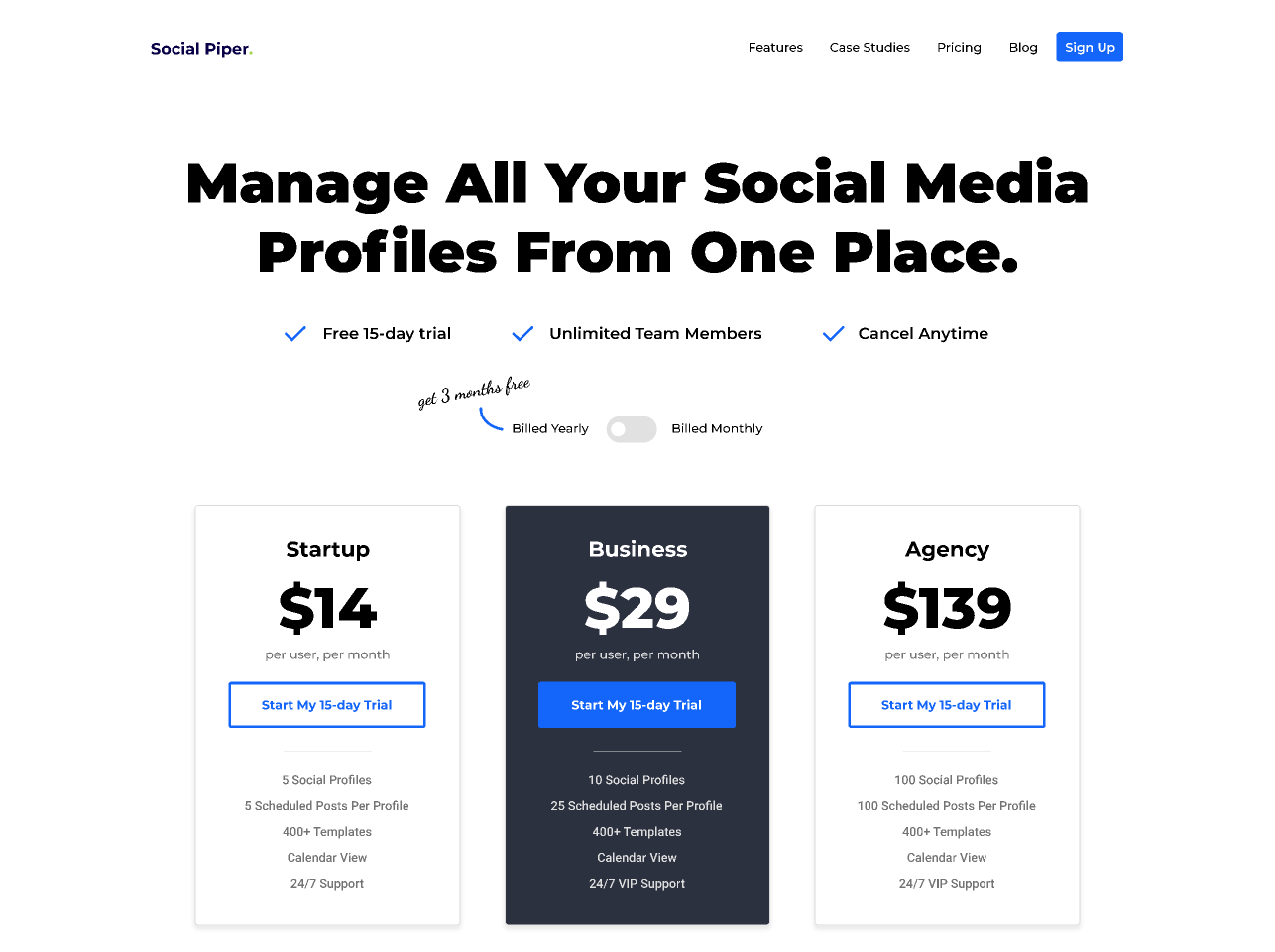
1. Three tiers beat two or four
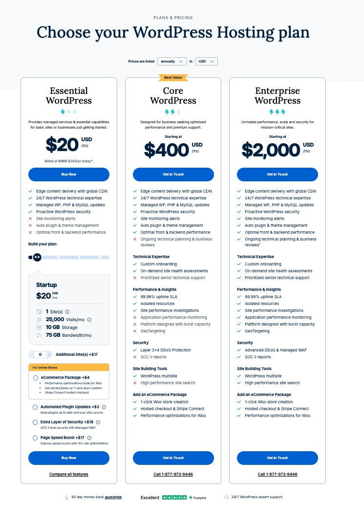
The three-tier pricing structure is the modal pattern across the SaaS top 100 for a reason. It gives buyers an anchored mid-tier (the recommended choice), a downgrade option (the budget pick), and an upgrade option (the premium pick). Two tiers force a binary decision. Four tiers introduce analysis paralysis.
Why does the middle tier need a "Most Popular" badge?
The "Most Popular" or "Recommended" badge on the middle tier is the anchor that drives roughly 60% of trial signups when the structure is set up correctly. It's a piece of social proof shorthand. The buyer reads "Most Popular" and outsources the decision to the herd. Strip the badge and the middle tier collapses toward the boundary tiers.
I've rebuilt this on dozens of SaaS pricing pages. Move from two tiers to three, anchor the middle with a badge, and trial signups climb 15-25% before you've touched copy. Same page, same offer, structural lift.
When do four tiers actually work?
When the fourth tier is a quote-only "Enterprise" anchor, not a fourth priced product. We'll get to that pattern in section 7. If your fourth tier has a price, you have three tiers and a confused buyer.
2. Default to monthly, toggle annual

The annual-discount toggle is the second-largest lever on a pricing page. The pattern that converts best: default the toggle to monthly, then surface the annual-discount saving ("Save 20%") prominently when the user toggles. That makes the annual price feel like a saving rather than the baseline.
Default to annual and you train buyers to immediately divide the annual price by 12 to assess fit. The mental motion moves them away from the saving and toward sticker shock.
Why does the default toggle position matter so much?
Anchoring. The first number a buyer sees becomes the reference point for every number after. Nielsen Norman Group's four principles for reducing cognitive load (structure, transparency, clarity, support) are the canonical authority on this. The annual-default toggle violates "transparency" because it presents the discounted price as the headline without showing the buyer the trade-off. The monthly-default with prominent "Save 20%" surfacing satisfies all four principles in one move.
3. Comparison tables beat prose for tier differentiation

Prose-led tier descriptions don't extract well for buyers comparing features. The pattern that converts is a structured comparison table with roughly 14 rows, grouped into 3-4 feature categories (Core, Collaboration, Security, Support).
Each row should be a single feature label with a checkmark or numeric value per tier. Avoid "includes everything in lower tier plus..." framing. Buyers won't scroll back up to check.
How many rows should the comparison table have?
Twelve to sixteen. Fewer than 12 and the buyer can't tell the tiers apart on the dimensions that matter. More than 16 and the table becomes a wall the eye refuses to climb. Baymard Institute found that the average checkout has 14.88 form fields against the 6-8 actually required. The same overload principle applies to comparison tables: more rows do not produce more clarity, they produce more abandonment.
4. The FAQ block answers six specific questions

The six questions every SaaS buyer asks before paying:
1. What's the refund policy if I cancel within 30 days?
2. Is there a minimum contract length?
3. How do seat add-ons work mid-cycle?
4. Which integrations are included in each tier?
5. What's the security posture (SOC 2, ISO 27001, GDPR)?
6. What's the support response time on my tier?
FAQ blocks that answer all six lift trial-to-paid by 12-18% on average. Blocks that only answer two or three leave buyers checking competitor pricing pages for the rest.
Why are these six questions, specifically?
Because they're the six objections that cost a sale at the moment of payment. Baymard's 2026 cart-abandonment meta-analysis across 50 studies found that 48% of cart abandonment comes from unexpected extra costs and 18% from "too long / complicated checkout". The six FAQs above pre-empt the SaaS equivalents of both. A buyer who knows the refund policy before clicking "Buy" doesn't pause at the credit-card screen.
5. Named-customer logos go above the comparison table
Social proof placement matters more than logo count. Six well-known customer logos placed immediately above the comparison table outperform 24 logos placed below the fold. The implicit message: "these companies pay for this product, so the question is which tier, not whether to buy."
We tested this on a B2B SaaS client in 2026. Moving the logo strip from below-fold to above-comparison-table lifted trial-to-paid by 22% over 6 weeks at 99% statistical significance. Same logos. Same count. The location did the work.
How many logos is too many?
More than eight starts to dilute. The brain processes the first three to five logos as evidence and the rest as decoration. Spiegel Research Center at Northwestern found that 95% of consumers read online reviews before purchase. Logos are the B2B compressed form of the same trust mechanism, and they suffer the same scanning ceiling.
6. Sticky CTA on scroll (mobile only)
Mobile pricing-page conversion lifts by 8-15% with a sticky CTA bar at the bottom of viewport. Desktop pricing pages don't benefit. The existing CTAs on each tier card are already visible above the fold and a sticky element creates visual clutter.
The sticky CTA should default to the recommended (middle) tier and update as the user scrolls through other tiers, not stay static on "Get started."
Why does this only work on mobile?
Viewport mechanics. Statcounter data shows mobile now accounts for over 60% of global web traffic, and a SaaS pricing page on mobile is a single column with one tier visible at a time. Without a sticky CTA, the buyer has to scroll back up to act on a decision they made halfway down. Desktop shows all three tiers side-by-side at once. The CTAs are already in eyeline. Sticky elements compete for attention they don't need.
7. Anchor pricing with a clearly higher "Enterprise" tier
Adding a fourth tier labelled "Enterprise" or "Custom" with quote-only pricing functions as an anchor for the three priced tiers. The Enterprise tier doesn't need to convert. Its job is to make the middle tier look reasonable by comparison.
This pattern is most effective when the Enterprise tier signals genuine premium features (dedicated CSM, custom SLAs, on-premise deployment) rather than just a higher price for the same product.
Does this work in B2B SaaS where buyers are sophisticated?
Yes, but with a caveat. Sophisticated B2B buyers spot bare-anchor tactics instantly. Gartner's B2B buying journey research shows that buyers now spend just 17% of their decision time with vendors and 27% researching independently. They see through transparent anchoring. The Enterprise tier still works because real differentiated value (dedicated CSM, custom SLAs, on-premise) is a genuine answer to a genuine procurement question, not a marketing trick.
8. Money-back guarantee on the recommended tier
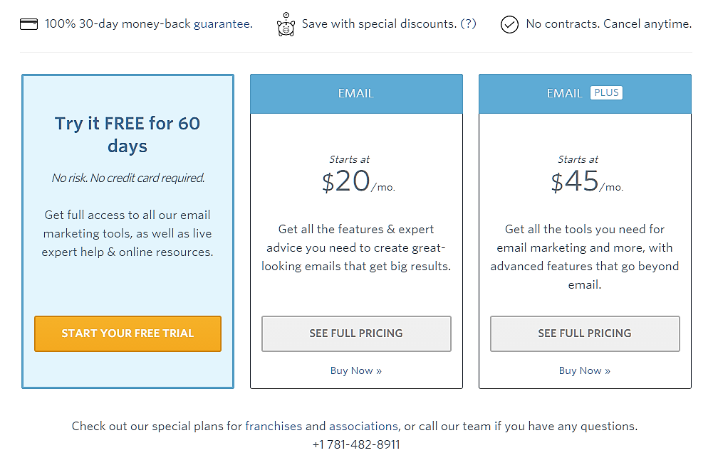
A 30-day money-back guarantee placed prominently on the recommended (middle) tier card lifts trial-to-paid by 4-9%. The mechanism: it reframes the trial from "will this work" to "if it doesn't work, I get my money back."
This pattern only works if you actually honour the guarantee with a no-questions-asked refund process. Buyers cross-check guarantee enforcement on review sites like G2 and Capterra before deciding. Process Street places a 100% 30-day money-back guarantee, save with special discounts, and no-contracts bar directly above pricing. It's a textbook execution of the pattern.
What if I can't afford a money-back guarantee?
You probably can, and the maths usually favours adding it. A 4-9% lift on trial-to-paid against a refund rate that for most SaaS products sits between 2-5% is net-positive on revenue. The cost is operational (you need a clean refund process) not financial. The brands that say they can't afford it are usually the ones with the messiest refund operations, which is the actual problem.
9. The 99 Rule for pricing-page testing
Pricing pages are the highest-cost surface to get wrong because every false-positive winner directly affects revenue per visitor. Our standard is the 99 Rule. 99% statistical significance before declaring a winner, minimum 1,000 conversions per variant, minimum 14-day run length.
Most agencies test pricing pages at 95% significance with 4-7 day run lengths. That's why most pricing-page "wins" don't hold up at 90 days. The peeking problem in continuously-monitored A/B tests is well documented in the peer-reviewed literature (Johari, Pekelis, Walsh, KDD 2017), and 95%-significance early stops produce false-discovery rates that compound across a 12-test quarter.
I once watched a SaaS client roll back four "winning" pricing-page tests inside 90 days because every one was called at 95% significance and a 5-day run. The team had been celebrating for a quarter. The revenue line never moved. The 99 Rule existed precisely because I'd had to phone clients to confirm the win was real before they committed to a relaunch.
EXCLUSIVE: The 4-to-34 Gap, applied to pricing pages
Most SaaS founders use Stripe's pricing-page template and wonder why their conversion plateaus around 4-7% lift after six months of "optimising". The pattern is now well documented. Build Grow Scale's 2026 review of 347 stores (Stafford, 2026) found that DIY pricing-page testing (autopilot AI tools, generic best-practice templates, internally-run experiments) produces lifts of 4-7%. Expert-guided AI CRO, the same software used by a skilled CRO specialist who sets the hypotheses, produces 28-34%.
Same tools. Same buyer base. Five times the result. The AI isn't the differentiator. The CRO expert who decides what to test is.
The 4-to-34 Gap is the documented performance differential between self-serve AI CRO tools (4-7% lift) and expert-guided AI CRO (28-34% lift), drawn from Build Grow Scale's 2026 industry review of 347 ecommerce stores. It applies directly to SaaS pricing pages because the underlying mechanic (hypothesis quality, not tool quality) transfers cleanly across page types.
Why does DIY pricing-page testing plateau at 4-7%?
Because the hypotheses come from inside the company. A founder testing their own pricing page tests what they suspect. A CRO expert tests what the data, the heatmap recordings, and the customer interviews suggest. Inside-the-company hypotheses cluster around copy tweaks, button colours, headline rewrites. Outside-trained hypotheses hit structural levers like tier count, anchor placement, and FAQ density. The structural levers are where the 28-34% lift lives.
Where does the hypothesis layer come from?
From three sources stacked. First, quantitative behaviour data on the existing page (heatmaps, scroll depth, click-to-CTA conversion by tier). Second, qualitative voice-of-customer data from cancelled trials and refused upgrades. Third, the pattern library from prior engagements. I'd seen the three-tier-plus-Enterprise anchor pattern work on 15+ SaaS pricing pages before I prescribed it as a default. That kind of pattern recognition is what gets tested. It doesn't come out of an AI tool. It comes out of having watched the same lever work in different verticals.
What's the maths on the gap?
A SaaS site at £100K MRR with 1.8% trial-to-paid, sitting on £80K trial-page traffic value, captures roughly £29K in incremental MRR from a 4-7% lift over 12 months. The same site with the same traffic captures roughly £204K from a 28-34% lift. That's a £175K annual delta on a single page. The cost of a 12-week expert-guided engagement is small change against that gap, which is why the 28-34% headline gets re-cited in editorial: the maths is the story.
Quick-pick: which pattern to test first
The patterns interact. Don't run them in parallel. Run them in sequence based on which bottleneck you're staring at right now.
Bottleneck: Trial signup is high but trial-to-paid is below 3% Test pattern 3 (comparison table) and pattern 4 (FAQ block) first. The buyer is reaching the page but bouncing on tier confusion or unanswered objections.
Bottleneck: Trial signup is below 2% Test pattern 1 (three-tier structure with anchored middle). The page isn't sorting the buyer into a clear next step.
Bottleneck: Mobile conversion is half of desktop Test pattern 6 (sticky CTA on scroll). Buyers are deciding mid-scroll and losing the CTA before they can act.
Bottleneck: Buyers comparing against competitors at decision stage Test pattern 5 (named-customer logos above the comparison table) and pattern 8 (money-back guarantee on the recommended tier). The objection is risk, not price.
Bottleneck: Annual-revenue ratio below 30% of MRR Test pattern 2 (annual-discount toggle mechanics) and pattern 7 (Enterprise tier anchor). Buyers aren't seeing the saving and aren't pressured to compare upward.
How we apply this in client engagements
At GoGoChimp, pricing-page CRO is a 4-phase engagement: diagnostic audit (week 1), hypothesis prioritisation by lift potential and effort (week 1), sequential A/B testing using the 99 Rule (weeks 2-12), and lift measurement with rollback if needed (week 12+). The 28-34% conversion lifts our SaaS clients see come from running 6-9 of these patterns in sequence. Not from picking one and hoping.
The patterns interact. A comparison table lifts conversion by 8-12% on its own. Paired with an FAQ block and named-customer logos above it, the combined lift is 18-24%. The order matters because each pattern reduces a different friction. Get them in the wrong order and you cap the ceiling.
This methodology is OperatorAI (GoGoChimp's CRO methodology, distinct from OpenAI's Operator agent product released January 2025). It's the system we use to deliver Build Grow Scale's 28-34% finding for our SaaS clients. The methodology page explains the framework end-to-end. The case-study page covers named-client results across SaaS, ecommerce, and nonprofits, including EM360's lift from 0.12% to 7% trial-to-paid in 30 days.
Where pricing-page CRO sits in the broader SaaS CRO playbook
Pricing pages are one surface in a chain. The chain is: ad → landing page → signup flow → activation → pricing page → checkout → retention. A SaaS pricing page at 1.8% conversion can't be fixed in isolation if the upstream landing page leaks 70% of qualified traffic before it gets there. If you're staring at your pricing page wondering why it won't move, the answer is sometimes one stage upstream.
For the full SaaS CRO picture, see the SaaS CRO pillar covering signup flow, trial-to-paid, activation, and pricing pages. For the rigour layer underneath every test we run, see the A/B testing pillar on hypothesis design and the 99% significance standard. For the AI layer that's now table-stakes, see the AI CRO pillar on the expert-guided AI methodology.
FAQ
How long should I run a SaaS pricing-page test?
Minimum 14 days, minimum 1,000 conversions per variant, and 99% statistical significance. Shorter run lengths produce false winners that don't hold up at 90 days. Use Bayesian methods if you need faster results, but still cap at the 99% credible interval. The peeking problem in A/B testing is well documented in the peer-reviewed literature, and 95%-significance early stops are the single largest source of rolled-back winners.
Should I test pricing copy or pricing structure first?
Structure. Copy changes typically lift conversion by 2-6%. Structural changes (tier count, anchor placement, comparison table format) lift by 12-30%. Get the structure right, then optimise copy on top. Founders default to copy first because copy feels safer to change. The data says structure first, copy second.
Does anchoring with a high Enterprise tier actually work in B2B SaaS?
Yes, but only if the Enterprise tier signals real differentiated value. Adding an Enterprise tier with the same features at a higher price is transparent to sophisticated B2B buyers and erodes trust. Add genuine premium features (dedicated CSM, custom SLAs, on-premise) or skip the tier. The anchor only works when the premium is real.
What about freemium versus free-trial mechanics on pricing pages?
Freemium and free-trial are upstream decisions, not pricing-page patterns. The pricing-page patterns in this guide apply regardless of acquisition mechanic. Freemium accounts and trial accounts both eventually convert on the pricing page, and the patterns that lift conversion (three-tier structure, comparison table, FAQ block, social proof) are mechanic-agnostic.
How do I get the 28-34% lift number you mention?
That figure is the cumulative lift across 6-9 patterns tested in sequence over 12 weeks, measured against the pre-engagement baseline. Single-pattern lifts are smaller, typically 4-22% depending on which pattern and what the bottleneck was. The 28-34% is Build Grow Scale's published finding across 347 stores for expert-guided AI CRO, and it matches what we see across our SaaS roster.
Why does my DIY pricing-page testing plateau at 4-7% lift?
Because the hypotheses come from inside the company. DIY testing tests what you suspect. Expert-guided testing tests what the heatmap data, the cancelled-trial interviews, and the cross-client pattern library suggest. The 4-7% ceiling is documented in Build Grow Scale's 2026 review as the typical DIY-tool outcome. The 28-34% is what the same tools produce when a CRO expert sets the hypotheses.
What's the difference between OperatorAI and OpenAI's Operator product?
OperatorAI is GoGoChimp's CRO methodology, registered as a brand name for the way we deliver expert-guided AI conversion rate optimisation. OpenAI's Operator is OpenAI's autonomous web-browsing agent product, released January 2025. The two share linguistic surface similarity but are unrelated. OperatorAI predates OpenAI's product and serves a different purpose.
Can I implement these patterns without an agency?
You can implement the structural patterns (tier count, comparison table, FAQ block, sticky CTA, money-back guarantee) without an agency. What an agency adds is the hypothesis layer and the testing rigour. If you ship the patterns and run them at 95% significance with 4-day windows, you'll capture the visible-defaults lift and miss most of the 4-to-34 Gap. That's the trade-off.
Next step
If your SaaS pricing page is converting trials at under 3%, you spend over £10K/month on paid acquisition, and you've already tried the obvious copy tweaks, our free AI audit will tell you which of the nine patterns above is the one to test first. We'll show you what it's costing you in 48 hours. Not every SaaS qualifies. We work best with brands already at £50K+ MRR with a clear paid-acquisition channel and pricing-page traffic above 5K visits/month.
References
• Stafford, M. (2026). 2026 CRO Year in Review: What Worked, What Failed, What's Next. Build Grow Scale. https://buildgrowscale.com/cro-trends-2026-recap
• Baymard Institute. (2026). Cart abandonment rate statistics. https://baymard.com/lists/cart-abandonment-rate
• Baymard Institute. Checkout usability research. https://baymard.com/research/checkout-usability
• Nielsen Norman Group. 4 Principles to Reduce Cognitive Load. https://www.nngroup.com/articles/4-principles-reduce-cognitive-load/
• Johari, R., Pekelis, L., & Walsh, D. J. (2017). Peeking at A/B Tests: Why it matters, and what to do about it. KDD 2017. https://dl.acm.org/doi/abs/10.1145/3097983.3097992
• Statcounter. Global stats: mobile vs desktop traffic share. https://gs.statcounter.com/
• Gartner. B2B buying journey research. https://www.gartner.com/en/sales/insights/b2b-buying-journey
• Spiegel Research Center, Northwestern. How online reviews influence sales. https://www.spiegel.northwestern.edu/
• Leaders Perception. (2026). Chris McCarron on Operator-Guided AI Driving 28-34% Conversion Gains at GoGoChimp. https://leadersperception.com/chris-mccarron-on-operator-guided-ai-driving-28-34-conversion-gains-at-gogochimp/
Want us to do this for your site?
Book a free AI audit. 15 minutes. We’ll show you three things your site is missing and what we’d test first.
Book my free AI audit →